Seattle Kraken is the name of an American professional hockey club, which was established in 2021 in Washington. The club was formed as an expansion of the Seattle franchise, which was approved in 2018 by the National Hockey League. Owned by David Bonderman, Jerry Bruckheimer, and Tod Leiwke, the club is managed by Ron Francis.
Meaning and history
Gas it is a newborn club, Seattle Kraken doesn’t have a rich and long visual identity history, but both of its logos — primary and secondary ones — are extremely stylish and memorable.
What is Seattle Kraken?
Seattle Kraken is the name of a professional hockey club in the United States, which was established in 2021 in Seattle, Washington. The club competes in the National Hockey League as a member of the Western Conference and has Climate Pledge Arena as its home stadium, and Dave Hakstol as the head coach.
2018 — 2020
The primary version of the Seattle Kraken emblem featured a stylized letter “S” which has its contours sleek and sharp. The letter has a dangerous and aggressive look due to the red “eye” placed in its upper part, and a spiked dark line coming through its body. These two features make the letter look like a true Kraken, and show the character and mood of the team, which was established with only one aim — to win.
The secondary version of the Seattle Kraken visual identity is a three-dimensional anchor in dark blue with some gradient shades. The anchor has its angles pointed and thin, which adds a sense of power and determination to the club’s overall image.
2020 — Today
The two versions of the logo can often be seen together — when the Kraken “S” is intertwined with the anchor, and in this case, the red eye of the emblem looks brighter and even more aggressive.
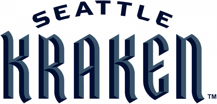
The text part of the hockey club’s visual identity is composed of an enlarged bold “Kraken” in all capitals, but the “N”, with an arched “Seattle” part, placed above it and written in a strict and clean sans-serif.
Font and color
The Seattle Kraken inscription uses two completely different types — a modern geometric sans-serif for the “Seattle”, with widened and strong capitals, and a sleek and sharp custom typeface for “Kraken”, with voluminous letters and a bit of a gothic mood.
The upper, arched line of the logo is executed in a custom font, which is close to Buncken Tech Sans font, but with the angles rounded and some cuts diagonal. As for the main, “Kraken”, part, is uses a designer type, which has a slight resemblance to such fonts as Cattedrale and Ravenholm, but with most lines modified.
As for the color palette of the Seattle Kraken visual identity, it is based on two shades of blue and their gradients. The lighter tone is in between sky-blue and turquoise, while the darker one in calm and velvet, almost black. The only bright detail of the emblem is red-eye.
The combination of blue and red colors stands for the passion and professional approach of a strong, confident, and brutal team, which knows exactly its possibilities and has big yet real ambitions.
Colors
DEEP SEA BLUE
PANTONE: PMS 296 C
HEX COLOR: #001628;
RGB: (0, 22, 40)
CMYK: (91, 77, 55, 70)
ICE BLUE
PANTONE: PMS 324 C
HEX COLOR: #99D9D9;
RGB: (153, 217, 217)
CMYK: (38, 0, 17, 0)
BOUNDLESS BLUE
PANTONE: PMS 2215 C
HEX COLOR: #355464;
RGB: (53, 84, 100)
CMYK: (82, 58, 45, 25)
SHADOW BLUE
PANTONE: PMS 549 C
HEX COLOR: #68A2B9;
RGB: (104, 162, 185)
CMYK: (61, 24, 20, 0)
RED ALERT
PANTONE: PMS 185 C
HEX COLOR: #E9072B;
RGB: (233, 7, 43)
CMYK: (2, 100, 92, 0)


