The professional ice hockey team Cleveland Monsters was founded in 2007 under the name of the Lake Erie Monsters. Now, it’s the top affiliate of the NHL’s club the Columbus Blue Jackets.
Meaning and history
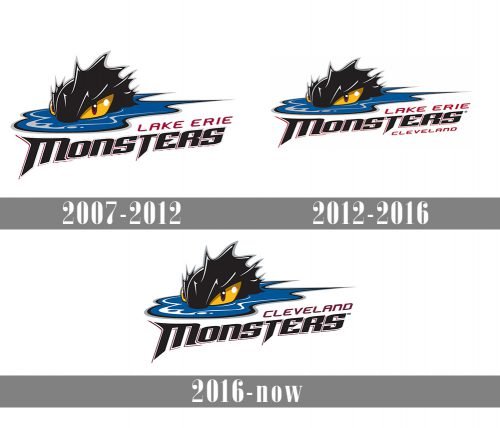
The Cleveland Monsters logo hasn’t changed that much during its more than ten years of history. Although it has gone through three modifications, they affected only the lettering and left the image itself untouched.
2007 — 2012
The original logo featured a monster’s head above the water, which was probably supposed to represent the water of the Lake Erie. The full name of the team was placed below.
2012 — 2016
In advance of the 2012/13 playing season, the team added the word “Cleveland” under the lettering.
2016 — Today
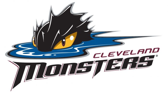
Having adopted the current name in 2016, the team removed the words “Lake Erie” from its logo and placed “Cleveland” above the word “Monsters.”


