 Scandinavian Airlines System Logo PNG
The flag carrier of Denmark, Norway, and Sweden, Scandinavian Airlines System was founded in 1946. The company is best known under the name of SAS, which is the abbreviation of its full name.
Meaning and history

SAS, or Scandinavian Airlines System, was founded in 1946 through the merger of three airlines from Sweden, Denmark and Norway. SAS was one of the first organizations that started with intercontinental flights. The first such flight was operated by the airline in 1954.
SAS is a member of a large international alliance, Star Alliance, which includes 18 carriers – Air Canada, Air New Zealand, ANA, Asiana Airlines, Austrian, bmi, LOT Polish Airlines, Lufthansa, Scandinavian Airlines, Singapore Airlines, South African Airways, Spanair, Swiss, Thai, United, US Airways, TAP.
What is Scandinavian Airlines System?
Scandinavian Airlines System, or SAS, is the name of an air carrier, which is based in Stockholm, Sweden. SAS is one of the oldest European airlines, as was established in 1946. Today the air carrier is a member of Star Alliance, has a fleet of 133 aircraft and operates flights to more than 120 destinations across the globe.
Before 1983

The initial badge, used by Scandinavian Airlines System until 1983, looked quite similar to the one we all can see today, but was executed in a black-and-white color palette, and feature a bit more text on it. It was an enlarged slanted “SAS” in all capitals of a fancy custom sans-serif typeface, set above the two-lined inscription, where the upper “Scandinavian” level was executed in a larger size, than the bottom “Airlines System”.
1983 – 1998

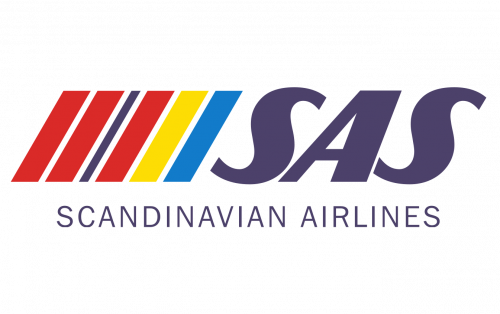
The redesign of 1983 added color to the SAS badge, and not just some, but a lot of it. The abbreviation was now set in muted purple, placed on the left from a geometric emblem, composed of several parallelograms of different thicknesses. Each of the figures was drawn in one of the following colors: red, dark blue, light blue, or yellow, just like the colors of the Scandinavian countries’ flags. The whole composition was underlined by the “Scandinavian Airlines” tagline in all capitals of a straight and simple sans-serif typeface, in the same color as the main logotype.
1998 – 2016

In 1998 the SAS logo becomes stricter and more laconic, which in this exact case is synonymous with professionalism and trustworthiness. The new composition was based on a simple square emblem set on the left from the plain black title-case logotype, written in a traditional sans-serif typeface with the letters slightly narrowed. As for the emblem, it was composed of a solid blue square with a bold white “SAS” logotype in its corporate typeface placed on it shifted a bit to the bottom.
2016 – Today

The Scandinavian Airlines System logo has a totally utilitarian style. There is nothing but the name of the company. Moreover, even the company’s name is given it its short, not full version.
This approach works pretty well (the SAS logo remains recognizable) as the company is large and well-known.
In spite of its simplicity, the design features symbolic details. The italics create dynamism, while the blue background reminds the sky.
Font and Color
The elegant yet stable uppercase lettering from the primary badge of Scandinavian Airlines System, or SAS, is set in a modern italicized sans-serif typeface with smooth lines of the contours and straight cuts of bars’ ends. The closest fonts to the one, used in this insignia, are, probably, Flighter, or Atomic Wedgie Regular, but with some modifications of the characters’ contours.
As for the color palette of the Scandinavian Airlines System, it is based on a calm and deep shade of blue, which stands for professionalism and reliability, and looks very sophisticated, evoking a sense of high quality and trustworthiness.


