Malaysia Airlines is the name of a national air carrier of Malaysia, which was established in 1947 as Malayan Airlines, which later changed to MAS or Malaysian Airline System. Today the company operates in more than 60 destinations across the globe, including Asian, European, and Oceanian cities. The airway is based in the Kuala Lumpur International Airport.
Meaning and history
 Malaysia Airlines is Malaysia’s national airline, with its main base in the Kuala Lumpur International Airport. This is one of the largest air series in its country and one of the oldest airlines in the world, founded in 1947. Currently, Malaysia Airlines is the parent airline of a large aviation holding company and owns subsidiary air carriers, MAS Wings, MAS Cargo, and FireFly.
Although the main base of the company is in Kuala Lumpur, it has two more locations for its fleet — Kota Kinabalu International Airport and Kuching International Airport.
What is Malaysia Airlines?
Malaysia Airlines is one of the largest air carriers in Malaysia and a member of Sky Alliance. The company was established at the end of the 1940s and by today has grown into an airline with over 80 planes, flying to 64 destinations internationally.
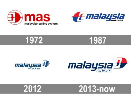
In terms of visual identity, the Malaysia Airlines logo has been updated not less than four times since 1972, and the name of the company has come to its current version only in 1987.
1972
The design of the air carrier logo from 1972 features the old name, “Malaysian Airline System.” The abbreviation “MAS” in red dominates the logo, while the full name is given in smaller letters. A stylized bird-aircraft symbol in red is placed to the left.
1987
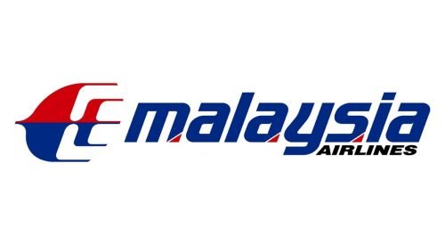
The redesign of 1987 took place after the official name change of the company to Malaysia Airlines. The new concept comprised a stylized bird emblem and a two-leveled inscription on its right. The bird was colored red and blue. The word “Malaysia” in the new name of the company is set in the lowercase and painted blue with red accents, the word “Airlines” is smaller and black.
2012
In 2012 the Malaysian Airlines logo was redesigned again. The Kelantan kite-bird from the previous designs now faces to the right and is blue with some grayish gradients. As for the lettering part of the badge, it is also set in dark blue and has its typeface more standard than on the logo from the 1980s. The refined inscription is set in the lowercase of a bold and italicized sans-serif font with the modern shape of the letters and straight cuts of the bars.
2013
The redesign of 2013 has introduced a new logo for Malaysia Airlines, which appears to be a hybrid of two previous versions. The lettering remained untouched since 2012, just became larger and got more air between the characters. As for the graphical part of the badge, the kite has been colored blue and red again, and placed on the right from the logotype, facing to the right too.
Font and color
The modern and progressive lowercase lettering from the Malaysia Airlines logo is set in a heavy sans-serif typeface with futuristic shapes of the letters, some angles rounded, and others — sharpened. The closes type for the one used in the visual identity of the air carrier from Malaysia is, probably, Handel Sans EF Bold Oblique.
As for the color palette of the Malaysia Airlines badge, it is set in blue and red, a classic combination, evoking a sense of professionalism and stability. Blue is not only the color symbolizing sky and flight, but also a graphical representation of safety and reliability.


