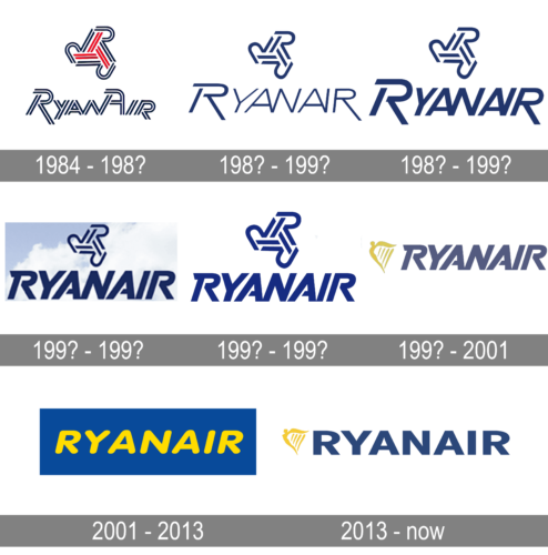
Over its 35-year history, the Ryanair logo has been growing simpler and better legible.
Meaning and history
What is Ryanair?
Ryanair is a European low-cost air carrier, which was established in Ireland in 1984. Today the airline has one of the largest fleets in Europe (over 500 planes) and operates its flights to more than 200 destinations across the continents. It is the biggest air carrier in its country.
1984 – 198?
The original design showcased an emblem consisting of three “R’s” in red and blue. The word “RyanAir” was made up of very unusual glyphs. Instead of a single line, they were “written” with three lines (two blue and one white).
198? – 199?
Although this version was created a while back, it looks quite modern thanks to its simplicity and clean look. The logo features only one color, with the “R” symbol and the first letter being bold and the rest featuring thinner strokes. The font was changed but the logo still had an “R” with a slightly elongated leg. The most noticeable change was the removal of a double line and the replacement of it with a more typical single-line stroke.
198? – 199?
The logo was updated once again. Here, all the letters had a bold stroke, which was bolder than the one used for the “R” previously. The name was now the center of attention while the “R” symbol was more of an embellishment. The designers modified the font but kept it very similar to the previous version.
199? – 199?
A blue sky with white clouds looks more than an appropriate background for a company that allows hundreds of people to enjoy this beauty every day. The font was made darker and slightly bolder to make the letters stand out. The key modification, though, was the removal of the elongated “R” leg, which was used by the company for some time. All the letters were now the same height and aligned along the bottom of the sky image. The font resembles the Yaro Op Black typeface.
199? – 199?
The company stayed pretty consistent when it comes to the brand image. This updated version brought back the white background and slightly larger “R” emblem. The inscription was kept unchanged. If a darker blue color looked nice against a cloudy sky earlier, this lighter blue looks friendlier and creates an image of a trustworthy company.
199? – 2001
There is something similar in the shape of the “R,” yet the type is new. This time, it is solid. A gold bird in flight is placed to the left.
2001 – 2013
The company name in bright yellow is placed inside a blue rectangle. The letters feature a friendly rounded type.
2013 – Today
The design echoes the 1987 version, although the type has been simplified.
Font and color
The uppercase Ryanair lettering from the official logo of the company is set in a stable geometric sans-serif typeface with a thick bar and straight cuts of the letters. The font, closest to the one used for the insignia, is, probably Nemorosa Extrabold, or Quarion Bold DEMO, but with the contours slightly extended.
As for the color palette of the Ryanair visual identity, it is set in yellow and dark blue, a combination, which usually stands for the sun and the sky in the logos of different airlines. Although here the shade of blue is more of a symbol of stability and professionalism.


