Turkish Airlines is the country’s national flag carrier airline. As of the summer of 2019, it operates scheduled services to 315 destinations. Turkish Airlines is headquartered in Istanbul Atatürk Airport in Yeşilköy.
Meaning and history
Turkish Airlines is one of the world’s largest and most famous air carriers. It was established in Turkey at the beginning of the 1930s, and today has grown into a company with more than 1,5 thousand daily flights.
Today Turkish Airlines serves more countries than any other airline and flies to over 300 destinations worldwide, including more than 51 domestic and many international destinations in Europe, Asia, Africa, and North and South America.
Apart from its flights, Turkish Airlines as a member of Star Alliance has codeshare agreements with around 49 other international airlines.
Whatare Turkish Airlines?
Turkish Airlines is the name of a leading air carrier from Turkey, which was established in 1933, and is headquartered in Istanbul. A member of the Star Alliance, Turkish Airlines has a fleet of almost 400 planes, which fly to 340 international destinations.
1933 – 1956
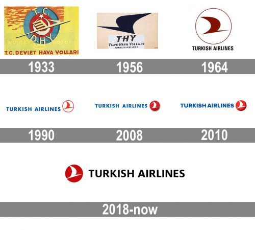
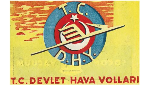
The initial Turkish Airlines logo was introduced in 1933 and stayed with the air carrier for more than twenty years. It was a bright yellow, blue and red badge, with the circular emblem in blue and red placed on a yellow rectangular background with red details and “T.C. Devlet Hava Yollari” inscription in all capitals, written along the bottom line of the logo.
1956 – 1964
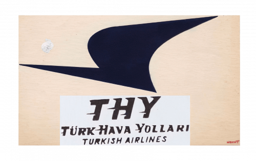
The redesign of 1956 brought a completely new style and spirit to the airline’s visual identity. The new color palette of dark blue and cream beige, with warm pink shades, looked fresh and represented flight and freedom. The main part of the logo was taken by a stylized abstract symbol, looking like a bird with a smooth thick wing, facing to the left. The lettering was written in three levels under the symbol. It was set on a white rectangular banner and used the same shade of blue, like the bird.
1964 – 1990
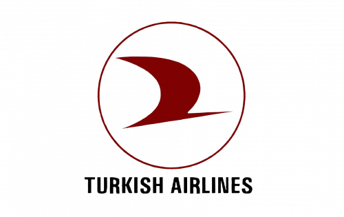
The bird was turned to the right and placed inside a thin circular frame, on a white background. Now the color palette was burgundy and black, with burgundy for the graphical part of the logo, and black — for the narrowed sans-serif inscription in all capitals. The logotype was shortened to just “Turkish Airlines”.
1990 – 2008
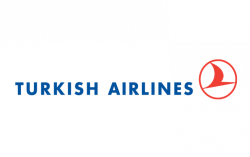
The logotype was enlarged and moved to the left from the emblem in 1990. In the same year, the color palette was brightened up and switched to blue and scarlet red on a white background. The emblem now featured a smaller size and looked modern and juicy in its new color scheme. As for the inscription, its typeface was refined and cleaned, now the contours of the letters were stricter and there was more air between the bars and symbols.
2008 – 2010
The redesign of 2008 made the Turkish Airlines badge three-dimensional. This version with a white bird on a glossy gradient-red background and blue gradients in the letters stayed with the air carrier for only two years. Although, it was one of the brightest badges of the company, created throughout the years. The typeface was also slightly refined — the bars got thicker and a bit shorter, which created a very special confident feeling and a sense of security.
2010 – 2018
In 2010 the company decided to get back to the flat logo version. The renewed color palette (a white bird on a red badge) remained untouched. But the circular framing was gone. A slight dark gradient touch stayed on the emblem, but the letters were now all solid and simple. The new minimalist approach to the logo design showed the company as a progressive and professional one.
2018 – Today
The Turkish Airlines logo has been inspired by probably the most obvious symbol of all the things flying, a bird. Here, the bird is absolutely abstract – just a curve (for the wing) over a diagonal bar (for the body). The body is directed upwards symbolizing the future and upward movement.
The words “Turkish Airlines” feature a plain sans with classic proportions.
Font and color
The bold uppercase logotype of Turkish Airlines is executed in a sophisticated yet strong and distinct sans-serif typeface, with is based on one of the classic fonts, such as Novel Display Extra Bold, Mayberry WGL Bold, and FS Irwin Bold, but with some lines modernized and a few angles — softened and rounded.
As for the color palette, the logo of the main Turkish air carrier is executed in a classic and timeless combination of red, white, and black. These three colors represent power, passion, and loyalty, at the same time reflecting the confidence, transparency, and progressiveness of the brand.


