The American Hockey League team San Diego Gulls was created in 2015 on the basis of the Norfolk Admirals franchise, which had relocated from Norfolk, Virginia.
Meaning and history
The San Diego Gulls were founded in 1966 by Robert Breitbard, a pivotal figure in San Diego’s sports scene. Initially part of the Western Hockey League, the Gulls began their journey as a minor league ice hockey team. Their inception marked a significant moment in San Diego’s sports history, laying the groundwork for a lasting hockey tradition in the city.
Throughout their existence, the San Diego Gulls have achieved several noteworthy successes. Notably, they won the Taylor Cup in 1996, a significant accomplishment in the West Coast Hockey League. Their journey through various leagues has been marked by a series of ups and downs, including multiple reincarnations and league changes. Despite these challenges, the Gulls have maintained a strong presence in the American hockey scene, often serving as a breeding ground for talent that moves on to the NHL.
In the current landscape, the San Diego Gulls are an affiliate of the Anaheim Ducks, competing in the American Hockey League (AHL). This affiliation has positioned them as a crucial stepping stone for players aspiring to reach the National Hockey League. The team continues to be an integral part of San Diego’s sports culture, with a dedicated fan base and a commitment to fostering high-level hockey talent.
What is San Diego Gulls?
The San Diego Gulls are a professional ice hockey team based in San Diego, California. Affiliated with the Anaheim Ducks of the NHL, they compete in the American Hockey League. Renowned for their history and contributions to the sport, the Gulls are a key player in the development of ice hockey talent.
2000 — 2004

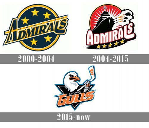
The original name of San Diogo Gull was Admirals, so the first two versions of the club’s logo were built around the wordmark with the original name. The logo, created in 2000, featured a navy blue circle in a yellow outline, with five five-pointed stars in two shades of yellow, and a diagonally located serif inscription. The lettering was executed in dark blue capitals, with the first letter enlarged and its horizontal bar replaced by a long yellow line, where the “Norfolk” in sans-serif uppercase letters was placed.
2004 — 2015

The logo was dramatically changed in 2004. It was a completely new mood and style — a scarlet-red circle in a black and yellow outline featured a sharp white sun-like element in it and an image of a massive black ship. Under the ship, the enlarged uppercase “Admirals” wordmark was written in a smooth and bold sans-serif typeface with arched full contours. The lettering was underlined by a black arch with five yellow stars on it.
2015 — Today
The San Diego Gulls logo and colors were unveiled during HockeyFest in the winter of 2015. The emblem featured the head of an anthropomorphized gull and also the gull’s paw, in which it was squeezing a hockey stick. The word “Gulls” in large letters paired with the smaller text “San Diego” was placed below. The design overlapped a black triangle.
Colors
The most eye-catching color of the palette is the vivid shade of orange used for the lettering and the gull’s beak. It creates a sharp contrast with the other colors, including black, white, silver, and blue.


