

![]() Norfolk Admirals Logo PNG
Norfolk Admirals Logo PNG
Of the two professional ice hockey teams with the same name “the Norfolk Admirals” one was an AHL franchise (2000-2015) and the latter is an ECHL team bearing the name since 2015. Both of them are related to Norfolk, Virginia.
Meaning and history
![]()
When the Bakersfield Condors relocated to Norfolk to become the Norfolk Admirals, they adopted the Admirals’ identity. So, the franchise has had five logos over its history.
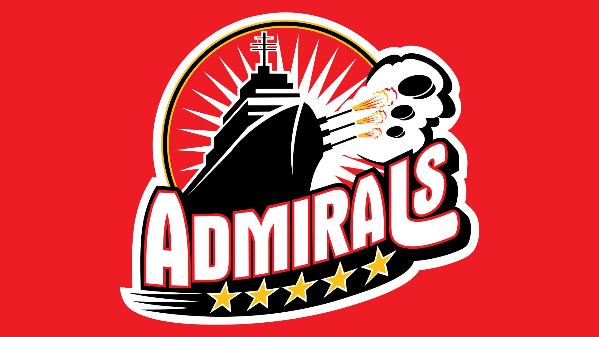
2000 — 2004
![]()
First there was a logo with a gold anchor and five stars against a navy blue circle. Then they used a logo with an anchor crossed by the team’s name. The third logo was the wordmark “Norfolk Admirals” on the familiar circle with the stars but without the anchor. The fourth one featured the team’s name, five stars below and a battleship firing pucks.
2004 — 2017
Former AHL team logo also used for team’s first two seasons in the ECHL:
![]()
2017
![]()
In 2017 the Norfolk Admirals introduced a new logo. They returned to the classic color scheme (blue and gold) and included some elements of the team’s first logo as well as of the US Navy emblem as a tribute to the veteran traditions.
Thus, the logo of 1989 is placed in the center of the new emblem with the colors reversed. The five stars represent the grade of Fleet Admiral. The nautical rope around the logo also refers to the US Navy.


