San Diego Clippers was the name of the professional football club, which is known by most as the Los Angeles Clippers. This was when the team played in San Diego from 1978 to 1984. Under the old name, however, the team didn’t get much results, and for the first time in history, the Clippers won the Pacific Division in the North American National Basketball Association regular season in 2013. And in general, this was not the only name change of this basketball club, because it was founded in 1970 in the city of Buffalo and was called “Buffalo Braves”.
Meaning and history
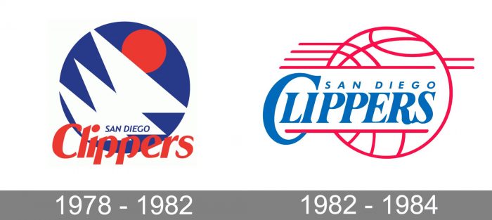
When the club moved to San Diego in 1979, it was renamed San Diego Clippers and, therefore, the need for a new logo arouse. Their first emblem was abstract and consisted of geometric shapes. There were three white overlapping triangles and a red circle above them. All these were placed inside a blue circle.
1978 – 1982

The initial emblem for the Clippers was created in 1978 and boasted an interesting modern composition with special geometry and an intense color palette. The solid blue circle had three white overlapping triangles placed on it diagonally and a smaller red circle, coming out of the white structure. The “San Diego” inscription in blue capitals was placed on the bottom part of the white triangle, and the “Clippers” was written in red over the bottom part of the emblem.
1982 – 1984

The redesign of 1982 kept the white, blue, and red color palette of the Clippers logo, but changed the composition. Now it was a contoured red basketball with three lines coming out to the left and two — to the right, as a sign of motion and speed. The “San Diego Clippers” lettering was set on a white background in blue italicized letters, looking modest entry very elegant.


