Centered in the heart of Texas, the San Antonio Spurs stand as a paragon of NBA excellence. This esteemed basketball franchise not only signifies the competitive spirit of the sport but also encapsulates the cultural and social ethos of its location. Operating amidst the vibrant community of San Antonio, the team has woven itself into the fabric of the city, echoing the energy and diversity of its surroundings. It’s here, in TX, where the Spurs have cultivated a deep connection with the fans, becoming an inseparable part of the team’s identity and success on the national stage.
Meaning and history
Founded by a group of businessmen in 1967, initially as the Dallas Chaparrals, part of the American Basketball Association (ABA), the franchise underwent a transformation when it moved to San Antonio and became the San Antonio Spurs in 1973. This move not only changed the team’s geographical location but also marked the beginning of its ascent in the basketball world. The Spurs’ journey is a testament to achievement and resilience, highlighted by their five NBA championships, which are central to the team’s main achievements. These victories in 1999, 2003, 2005, 2007, and 2014 underscore the franchise’s commitment to excellence and its ability to compete at the highest levels.
Currently, the San Antonio Spurs continue to evolve, maintaining a significant position within the NBA. The introduction of a new logo and updates to their visual identity reflect the franchise’s ongoing commitment to innovation and staying relevant in a fast-paced world. The latest updates aim to connect with a broader audience, including the Chicano population of San Antonio, by incorporating elements such as teal and orange colors reminiscent of the city’s fiesta and the flag, along with a silver spur at the bottom of the logo. This evolution of their brand resonates with Spurs fans, offering new products and engaging experiences through promotions like promo codes, free shipping, and a streamlined production process that enhances the checkout experience. The team’s name, anchored in the rich history and cultural tapestry of Texas, continues to symbolize resilience, community, and excellence as they look forward to introducing innovative strategies and achieving new milestones.
What is the San Antonio Spurs?
The San Antonio Spurs, an iconic NBA franchise, represents a blend of sports excellence and cultural significance. With a history rich in achievements and a commitment to community, the Spurs continue to be a source of pride for fans and a key player in the NBA.
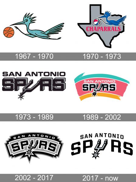
1967 — 1970

The initial emblem for the club from San Antonio was created when the team was called Chaparrals. The first badge was funny and cartoonish — with a light blue bird running with an orange basf key all. This amateurish version of the logo stayed with the club for only three years.
1970 — 1973

The redesign of 1970 strengthened the line of the bird and a ball and placed it on the light gray state contour. The color palette of the whole emblem was switched to blue, white, gray, and red, which is an extremely elegant combination.
1973 — 1989

The name of the team was changed to San Antonio Spurs in 1973, and this is when the first version of the logo we all know today was introduced. A dark-gray and black combination featured a massive and brutal inscription with the letter “U” replaced by a spur image.
1989 — 2002

In 1989 the masculine and dark logo was placed on a bright background, composed of three arched lines — turquoise, light pink, and yellow. It was a very delightful and memorable badge, with a great balance of playfulness, elegance, and power.
2002 — 2017

The colorful background was removed in 2002. Now the black and gray lettering is arched and placed on a light gray banner in a black frame. The “San Antonio” part of the logotype is now placed on the upper part of the frame.
2017 — Today
 In the 2017 version, the arched effect of the previous emblem, as well as the “spur” on the “U” remained as they were, while the typeface was customized. Today, the team uses the full wordmark as its global logo, while the status of the primary logo inside the country belongs to the stylized “U”.
Alternative symbol
In addition to the primary emblems, the Spurs also have a secondary logo, which can often be seen on the brand’s merchandise. The secondary logo is based on a stylized basketball with the letters “S” and “A” in its center. Both the letters have distinctive diamond-shaped angles, like some of the glyphs of the regular logotype.
Font
The official Spurs logo guideline sheet cites Helvetica Bold as the team’s official font. However, the club’s wordmark features a different typeface. One of the distinctive features of the custom type is the diamond-shaped angles on the S, O, P, R, while the N, A, and T look very much like the corresponding glyphs from the Helvetica Bold font.
Colors
Black (PMS Black) and silver (PMS 877) are the team’s official colors. Both of them are featured on the San Antonio Spurs logo against the white background.
SILVER
PANTONE: PMS 877 C
HEX COLOR: #C4CED4;
RGB: (196, 206, 211)
CMYK: (5, 0, 0, 20)
BLACK
PANTONE: PMS BLACK 6 C
HEX COLOR: #000000;
RGB: (6, 25, 34)
CMYK: (30, 0, 0, 100)


