 Rutgers Scarlet Knights Logo PNG
The name the Rutgers Scarlet Knights is used to refer to the over 25 athletic teams representing Rutgers University’s New Brunswick campus.
Meaning and history
Tracing its origins to the historic grounds of Rutgers University in New Brunswick, New Jersey, the Rutgers Scarlet Knights emerged as a distinguished name in American collegiate sports. This athletic division was established in the 19th century, embedding itself in the annals of sports history. Among their crowning moments is the inaugural college football game against Princeton in 1869, a landmark event in collegiate sports history. The Scarlet Knights have since flourished across a spectrum of sports, including football, basketball, and wrestling, cementing their status in collegiate athletics. A particular highlight is the women’s basketball team, propelled to national recognition under Coach C. Vivian Stringer. Their accomplishments have been a beacon of excellence and competitiveness. As of now, the Rutgers Scarlet Knights continue to thrive in the NCAA, particularly within the Big Ten Conference, embodying a blend of tradition, sportsmanship, and athletic prowess that resonates through Rutgers University’s vibrant sports culture.
What is Rutgers Scarlet Knights?
The Rutgers Scarlet Knights symbolize the athletic spirit of Rutgers University, actively competing in NCAA Division I. They represent a tapestry of athletic dedication, participating in diverse sports and epitomizing competitive zeal and excellence. This entity not only reflects the university’s sporting ethos but also contributes to the broader narrative of American collegiate athletics.
1967 – 1972

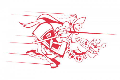
The brand’s original logo was a red and white image of a knight holding a spear and riding a horse. The knight was sitting on a saddle with a white ‘R’ character.
1972 – 1981

The next logo was a red knight’s helmet image drawn over a white area with red outline.
1981 – 1997

Eventually, in 1981, the brand designers changed the Rutgers’ emblem of knight’s helmet and put an inscription ‘N. J. Rutgers’ as the main logo. It had a red bold typeface with large letters, some of which had elongated tails serving as top lines and bottom lines.
1997 – 2001

Over the last 25 years, the university’s athletic brand identity has evolved from a pretty cluttered emblem to a more minimalistic and cleaner one.
The Rutgers Scarlet Knights logo introduced in 1995 featured a knight in armor. He was holding a sword forming the letter “t” in the word “Rutgers” positioned below.
2001 – 2016

The 2001 logo is a large ‘R’ character colored red.
2016 – Today
In 2004, the university adopted a completely different emblem. Here, there is only the large letter “R.” It looks pretty clean yet absolutely generic, we should mention.
Rutgers Scarlet Knights Colors
SCARLET
HEX COLOR: #CC0033;
RGB: (204,0,51)
CMYK:(0,100,81,4)
PANTONE: PMS 186
GREY
HEX CODE: #5F6A72;
RGB: (95,106,114)
CMYK: (11,0,0,64)
PANTONE: PMS 431 C
BLACK
HEX CODE: #000000;
RGB: (0,0,0)
PANTONE: PMS BLACK 6 C
CMYK: (0,0,0,100)


