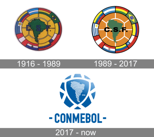
During the first hundred years of its existence, the South American Football Confederation (CONMEBOL) used one and the same logo. It depicted the South American continent in green encircled by the flags of the countries that belong to the Confederation.
Meaning and history
The Confederación Sudamericana de Fútbol, commonly known as CONMEBOL, was founded on July 9, 1916, in Buenos Aires, Argentina. It was established by the football associations of Argentina, Brazil, Chile, and Uruguay, primarily to organize the first continental competition, the Copa América. Over the years, CONMEBOL has grown significantly in its influence and scope. One of its main achievements includes establishing and managing major South American football tournaments like Copa Libertadores, a prestigious club competition in South American football, equivalent to the UEFA Champions League in Europe. Additionally, CONMEBOL plays a critical role in managing the qualifying rounds in South America for the FIFA World Cup.
The organization has also been instrumental in the growth and development of football across the continent, fostering talent and competition at various levels. In recent years, CONMEBOL has worked towards modernizing its operations and enhancing the global appeal of South American football. It has implemented various reforms to increase transparency, competitiveness, and financial stability within its member associations. Currently, CONMEBOL stands as a crucial pillar in the global football community, continually striving to elevate the standard and popularity of football in South America.
What is CONMEBOL?
CONMEBOL is the name of the football confederation of South America, established in 1916, which makes it one of the oldest football associations in the world. Today the confederation consists of ten members and has Alejandro Dominguez as the President.
1916 — 1989

The very first logo for CONMEBOL was created in 1916 and stayed with the confederation for more than seventy years. It was an interesting and bright circular badge with the green contours of the South American continent in the middle. The green silhouette was set on a yellow background and enclosed into a colorful framing, consisting of various flags of the contoured from the continent. The “C. S. F.” Lettering in blue was set in the middle of the badge, over the green continent.
1989 — 2017

The redesign of 1989 kept the original concept and colors of the CONMEBOL visual identity, but strengthened the badge, cleaned the lines, and modernized everything. Now the middle part of the badge was more resembling a football, with its calm brown color and white stitches. The flags around the perimeter became brighter and more readable, while the green South American continent looked brighter even without a black outline.
2017 — Today
The current CONMEBOL logo, which was designed in-house, was introduced in 2017. The emblem features a stylized football. In the middle, there’s the map of South America filled with a unique digital fingerprint. The name of the confederation is given below in a bold san serif and condensed typeface. The abstract shape consists of 10 pieces, each representing one of the ten countries comprising the federation.


