Rolling Stone is an American monthly magazine with its focus on the popular culture. It was founded in San Francisco in 1967 by Jann Wenner. The current owner of the Rolling Stone magazine is Penske Media Corporation.
Meaning and history
Visual identity of the legendary magazine, dedicated to everything connected to rock music, was created in the middle of the 1960s, and since then has never left the colorful cover of the editorial, being only slightly refined in 2015.
What is Rolling Stone?
Rolling Stone is the name of one of the world’s most popular magazines about music and culture, which was established in California at the end of the 1960s. The monthly magazine issues more than half a million copies worldwide, with the magazine available in different languages.
1967 – 1975
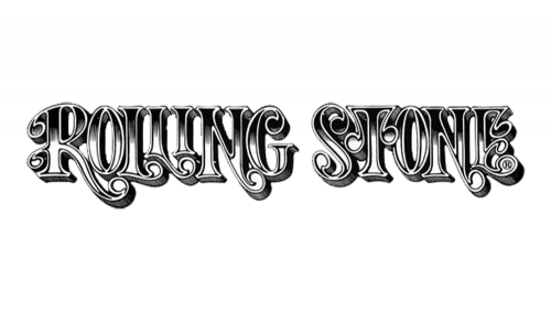
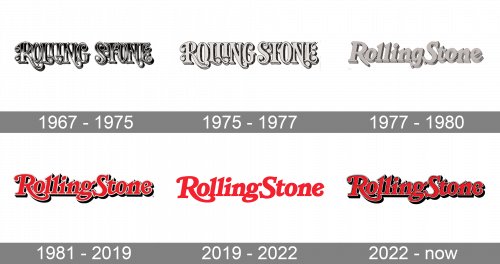
The logo was originally a name wordmark made of Gothic, metallic-looking letters. They all were a sort of bold, elegant serif with drop-like extensions all over. The colors were black and white, and they originated from the top and bottom of the letters respectively.
1975 – 1977
In 1975, it was reworked to look more like a sketch. As a result, the different shades and gradients were removed in favor of various hash strokes and mostly grey letters.
1977 – 1980
A few years later, the wordmark was given a more mundane font. There were now lowercase letters as well as uppercase ones, and they visibly scaled down on elegance. The concept actually persisted, in that it was still a combination of grey letters with hashed darker undersides. This time, however, it felt more like a 3D product.
1981 – 2019

This time, they slightly updated the font to be somewhere between the two previous editions. There were now 3 colors: bright red for the letters themselves, white for the outlines and black for the undersides.
2019 – 2022
The first redesign of the Rolling Stone visual identity did not affect the unique style and individuality of the logo, though it simplified and cleaned its contours. The emblem we all can see today is a simple flat logotype in scarlet-red, with no volume and outlines. The letters on the new version look more elegant and thin, making the badge timeless and sophisticated.
2022 – now
The redesign of 2022 has brought back the voluminous style of the logo, which is pretty close to the version from 1981 but has its contours and color palette refined. The shadow and the outline of the iconic inscription became darker and thicker, which added depth and confidence to the whole composition, making it look brighter and more brutal.
Font and color
The iconic red lettering from the official logo of the Rolling Stone magazine is set in a custom serif typeface, which is based on one of the following fonts: Claremont RR Extra Bold Italic, ITC Bookman Demi Bold Italic, or Bookmania Black Italic, but with some characters modified.
As for the color palette of the Rolling Stone visual identity, it is based on an intense scarlet shade of red and is usually placed against a white background. But the intensity of red allows placing the logo on different patterns and shades without losing its individuality. The redhue here stands for passion, power, and energy.


