

![]() Squid Game Logo PNG
Squid Game Logo PNG
Squid Game is a South Korean web-series, released in 2021. It’s a nerve-wrecking adventure thriller, whose plot revolves around a fictional survival game. Several dozen people take part in it in the show, and the prize for surviving the whole ordeal is 40 million dollars. The challenges are harsh, terrifying and deadly. Squid Game received overwhelmingly positive reviews for viewers, and the season 2 is planned for 2024.
Meaning and History
![]()
The show was released by Netflix in 2021. The series is inspired by iconic Korean thrillers of the 20th century. They were well-known for their pressing, hopeless and depressive feel. The name is derived from the popular children’s game that was popular in Korea in the 80s. It doesn’t have much common with it, however.
What is Squid Game?
Squid Game is the name of one of the Netflix projects, which was created by the South Korean director Hwang Dong-hyuk in 2021. The survival tv-series is composed of nine episodes and tells a story about a group of people, who risk their lives to win a money prize, competing in a weird and hostile game, based on innocent kids’ entertainment.
2021 – today (Korean)
![]()
The domestic logo of the show depicts the name of the series, written in Korean. The style is geometric on purpose, as various geometric figures are central for the plot of the series. As such, the letters are written in a linear, simplistic way. They are also positioned on various levels: some characters lower than the others, and vice versa.
2021 – today (International)
![]()
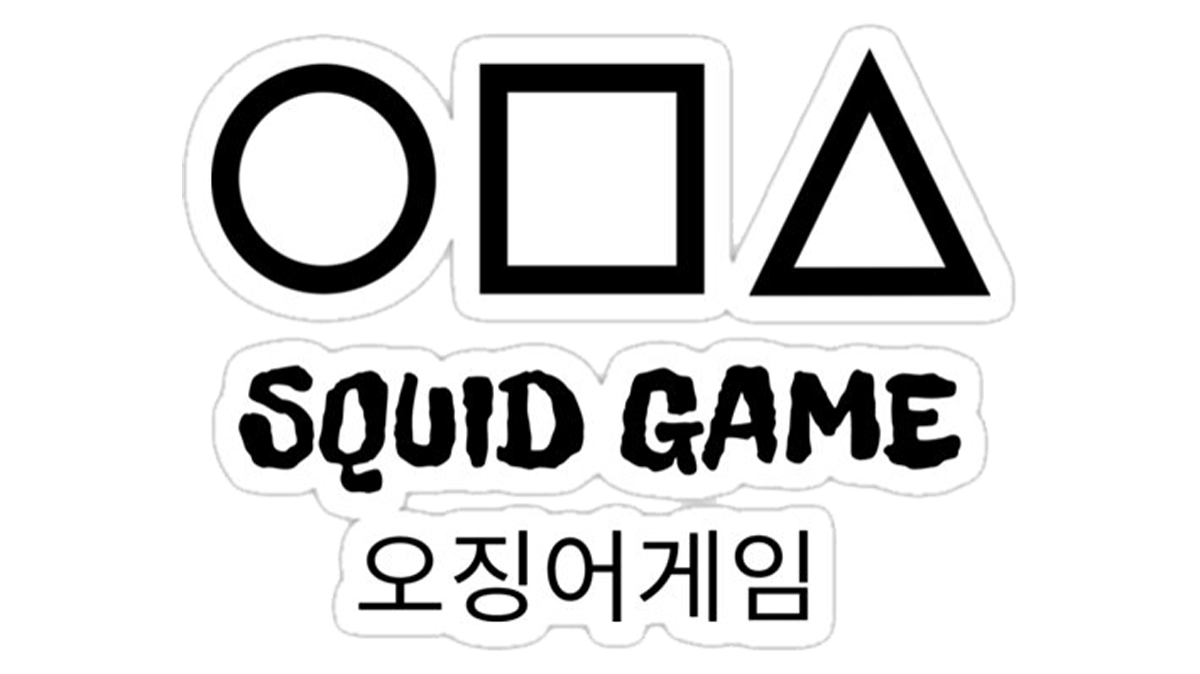
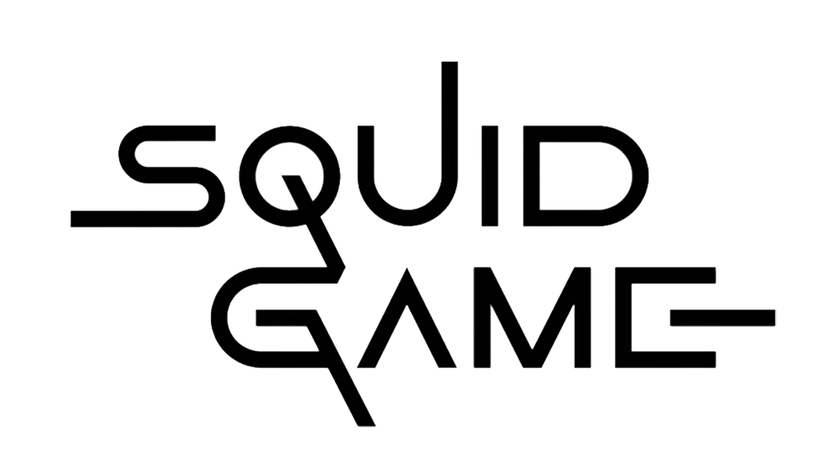
There is an international version of the same logo, depicted in a similar style, but in English. They wrote it in two lines of capitalized letters. The font was simple and linear. Some of these letters were modeled specifically to resemble geometric figures, yet again. They include the letters ‘O’, ‘A’ and ‘E’. While most lines were black, the areas inside these three were pink. There are also several examples of longer, unnecessary lines, drawn solely for aesthetic value.
Font
As mentioned, the font for both Korean and English versions of the logo used straight lines and simple geometric shapes. Stylistically, the English letters were sans-serif characters with squat, wide proportions. It doesn’t mean they are abrupt and rough. In the English variant, the turns are also round and smooth, where need be. In other parts, they are sharper, that’s true.
Color
The logos mainly use a combination of black and pink. For the Korean version, it means there are three elements in that writing that resemble a circle, a triangle and a square. While the rest is colored black, these three bits are bright pink. The same is true for the English variant, except the lines are all black there. The three letters that resemble said figures the most are filled with a darker pink.
At least, that’s the usual color scheme. In some versions, they replace black with white (for instance, in the main poster for the series).


