New Line Cinema is the name of one of the most well-known movie production studios in the world, which was established in the USA in 1967. After the merger of 2008, the studio became one of the Warner Brothers subsidiaries, but kept its name and still released large projects for the billions of people across the globe.
Meaning and history
One of the most legendary studios in the history of world cinema, New Line Cinema, was founded by Robert Shaye, and in its half-century history has released such films as “A Nightmare on Elm Street,” “Friday the 13th,” “The Mask,” “Austin Powers” “Rush Hour,” “Boogie Nights,” the “Blade” trilogy, and the gem of the studio – the “Lord of the Rings” trilogy. There were others too. Many.
After the takeover by Warner Bros., New Line began to produce smaller films. After becoming a genre division of Warner, the studio concentrated on light comedies and horror films, the very genres for which it gained fame popularity, and financial success at the beginning of its history.
Although the company was established in 1967, the first official on-screen emblem was only created in 1973.
1967 – 1979
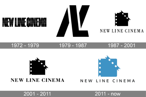
The very first logo was created for the New Line Cinema company in 1967 and stayed untouched for almost a decade. It was a bold uppercase lettering set in a geometric sans-serif typeface, with the bodies of the characters having a horizontally-striped pattern, with the thin white lines getting more frequent in the middle of the letters. And this has created a shiny gradient of the inscription, adding volume and motion to the stable lettering.
1979 – 1987
The New Line Cinema logo from the 1970s featured a bold and minimalistic composition that looked very stylish and futuristic for its times. It was an uppercase “NL” monogram with the overlapping letters in a stencil sans-serif typeface. The vertical bar of “L” was replacing the diagonal one in the “N”. Executed in solid black, and set on a transparent background, the badge looked sharp and stable, showing the company as a responsible and professional one.
1987 – 2001
The redesign of 1987 brought a new idea to the studio’s visual identity, and the new badge became the basis for all the following logo refinements. It was a solid black film square, embellished with five small white squares along the left vertical side, and diagonally overlapped in the right by a rectangle with four more squares on it. The elegant and classic uppercase “New Line Cinema” logotype was written under the emblem in a medium-bold and slightly narrowed serif typeface, also in black.
2001 – 2011
The logo was refined in 1001, and this version is still being used by the company along with the newest emblem. It was pretty much the same logo as the one introduced in 1987, but with the emblem slightly condensed and the lettering emboldened. The new typeface featured all the letters more full-shaped and stable, and due to the use of thicker lines, it was now as eye-catching as the monochrome film-square graphical part of the badge.
2011 – 2024
After the company becomes a Warner Bros subsidiary, the logo is being refined again in 2011. The square on the emblem gets its original size and shape, but the corners are being rounded, which makes the whole image more modern and even sleek. The lettering here was also modernized, and the classic and elegant serif typeface got replaced by a light and cool sans-serif, with a lot of air in and between the words of the logotype. It brought a fresh mood and energy to the iconic badge, making it look progressive and evoking a sense of motion.
2024 – Today
The redesign of 2024 has added distinction to the iconic logo by sharpening the angles of the emblem. The lines got straight and strong, and now the medium-weight sans-serif lettering looks more harmonized with the renewed geometry of the graphical part.


