

![]() One Piece Logo PNG
One Piece Logo PNG
One Piece is a comic franchise started by Eiichiro Oda. Since 1997, One Piece manga has been published by Weekly Shōnen Manga journal. It describes the story about a teen adventurer named Monkey D. Luffy, wearing a distinctive thatch hat. His body was granted rubber features for eating one of the Devil Fruits – mysterious fruits giving you superpowers but taking away your ability to swim. With his friends, Monkey explores the planet to get a gem known as One Piece and become a new leader of pirates. There is a TV show titled One Piece, made on the basis of the comics.
Meaning and history
![]()
The designer of the One Piece concept, Eiichiro Oda, had long been curious about pirates. Since he was a child, he had been fantasying about pirate life. Along with life descriptions of the real pirates, it inspired Oda to make a manga about a teenager boy who creates a team of adventure hunters and goes on a trip to get an ultimate treasure and declare himself the head of the pirates. The gem name would give the name for the franchise – One Piece.
Eiichiro Oda began working on the manga in 1996, while partnering with Nobuhiro Watsuki, another manga artist. One Piece was launched as two short stories named Romance Dawn, in which Oda described the personage of Luffy, as well as his primary attributes. Later, the Romance Dawn name became the title of One Piece’s initial chapter and book name. These works were posted in Summer 1996. Then, the manga production was put on a stream, and the following One Piece cartons were posted in Weekly Shōnen Jump magazine.
What is One Piece?
One Piece is a manga authored by Eiichiro Oda. The plot takes place in a pirate world, where a seventeen-year-old treasure hunter named Luffy eats one of the so-called Devil Fruits, after which his body becomes stretchy. Then, he forms a pirate team with which he goes travelling to search for the super treasure named One Piece. This manga has been published since 1996, and since that moment Eiichiro Oda’s team wrote multiple One Piece comic books used for a full-scale anime also titled One Piece.
1997 – Today
![]()
The original One Piece logo was introduced in 1997 and is still used by the brand today, along with two other versions. It was a black-and-white banner with the stylized uppercase name of the brand written between two long horizontal lines. Each letter of the inscription was unique: the “O” had a skull with two crossed bones in its negative space, the “I” was replaced by a silhouette of a person, the last “E” was drawn as an anchor, set on its side, with the rope knotted to it and intertwining the bottom horizontal line, getting to the teeth of the skull in the first letter.
1999 – Today
![]()
The redesign of 1999 has kept the unique composition of the One Piece logo, but made it in color now, and added the Japanese lettering to the central part of the upper horizontal line. Now the main shade of the badge was gradient-blue, with some additions of red, yellow, and brown on the main graphical emphasis of the banner. As for the hieroglyphic inscriptions, it was set in a calm dark navy shade, adding a serious and stable touch to the playful image.
2004 – Today
![]()
One Piece’s general logotype never changed. It depicts the nameplate, contoured by two thin lines from up and down. A skull wears a thatch hat and glances out of the inner area of the premier ‘o’ character, which has two bones crossing one another behind it. The ‘i’ symbol is styled as a silhouette of the central person of the franchise – Luffy. The last ‘e’ symbol looks like an anchor with a rope bound to it. This rope intertwines the logotype’s lower outline, and its end is held in the familiar skull’s teeth.
Although this is the general logotype, there are many other variations on the Internet. These are the logotypes used episodically on some volumes’ covers or in some series of the One Piece anime. These logotypes may have different elements, shades, and features, but the main pirate concept is always visible.
Color

The coloring palette of One Piece’s primary logotype consists of blue, red, white, black, brown, and yellow shades. This is how they’re set up: most of the letters are blue with a black contour, but the ‘i’ symbol, styled as Monkey’s silhouette, is red. Red is also used to depict a line on the yellow hat wearied by the white skull. The head’s eye and nose holes are black. The bones behind the initial ‘o’ are also white with a black outline. Finally, the rope is brown with some black lines on it.
Font
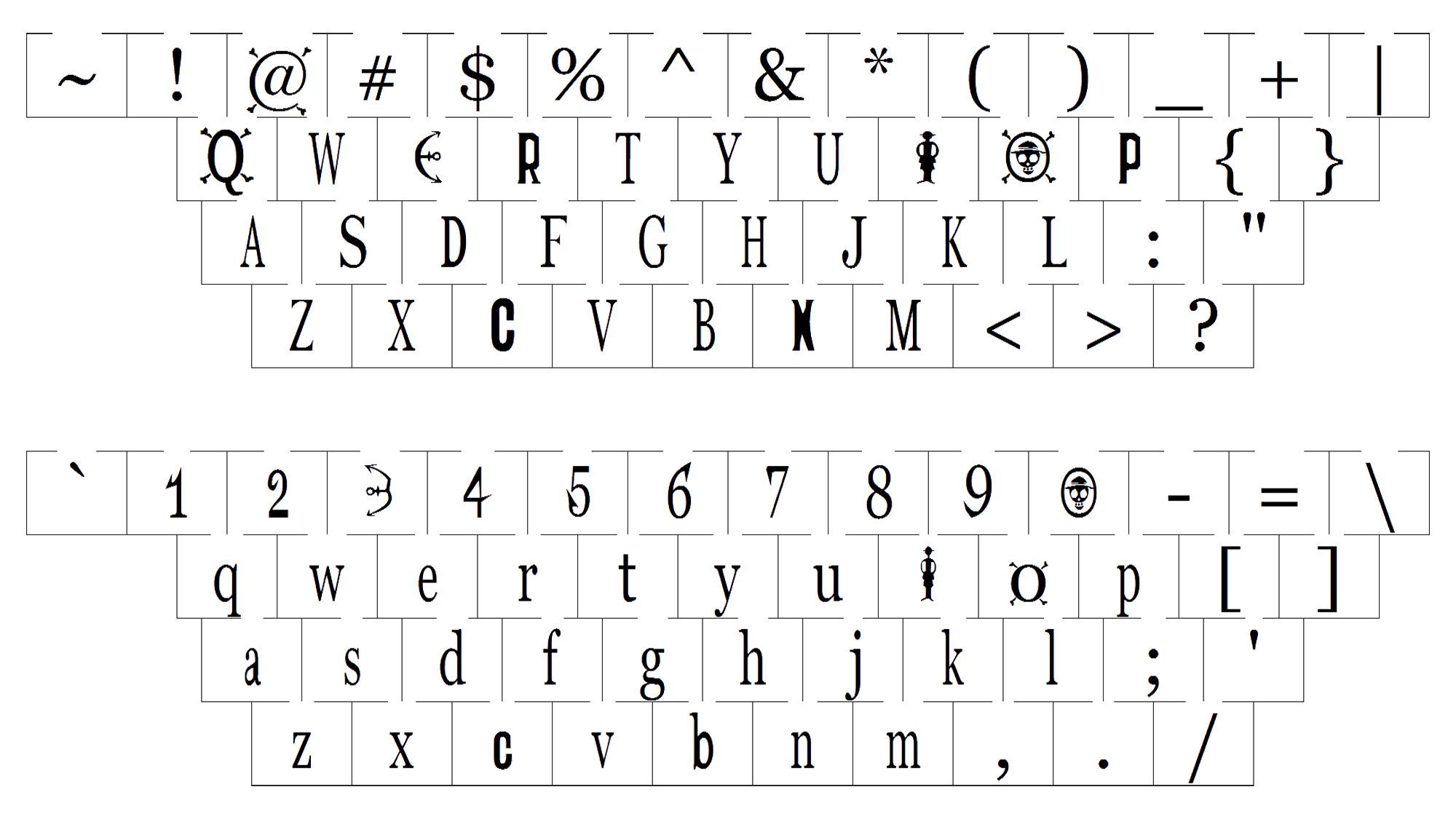
Omitting the stylized ‘o’, ‘e’, as well as ‘i’ characters, the inscription has a custom serif typeface. The letters have quite bold bars with small yet sharp serifs and small intervals in between. The characters are elongated and narrowed.


