Peanuts is one of the most popular comic strips in the US. It ran from the fall of 1950 to early 2000 and continued in reruns later. It has been estimated that the readership of the newspapers where it ran was about 355 million.
Meaning and history
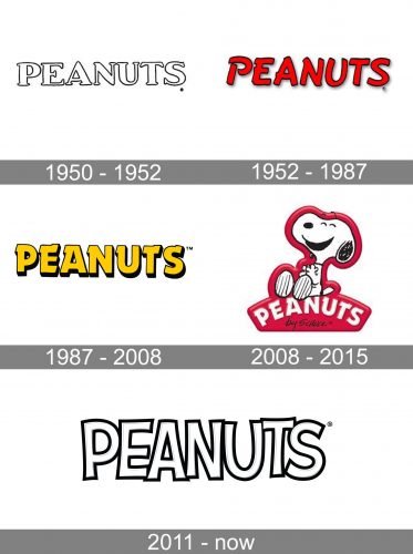
While there were only three main versions of the Peanuts logo during the life of the author, Charles M. Schulz, more versions were added afterward.
What is Peanuts
Peanuts is probably the best-known creation of Charles M. Schulz, one of the most influential American cartoonists of all time. It was translated into 21 languages and appeared in more than 2,600 newspapers.
1950 – 1952, 1951 – 1952 (Sunday issues)
The Peanuts started as a daily strip in the fall of 1950 in seven newspapers, from The Washington Post to Chicago Tribune.
The original logo showcased the name of the project in a rather bold serif typeface. The thickness of the strokes varied a lot from one glyph to another. There was a slight casual touch, which made you feel the letters had been drawn by hand without the help of instruments like rulers (or, at least, without relying on them too much). This resulted in an individual touch.
Yet, we can’t say that the “peanut” shape was reflected very well in the logo, like, for instance, it was reflected in the way Snoopy, one of the characters, looked. You can notice only a subtle hint on the shape in question. It appears that the author didn’t want to do it, didn’t want to make it too obvious, or, alternatively, didn’t consider the logo worth the effort.
1952 – 1987
This one looks a bit more individual. It is partly due to the addition of the color and partly due to the updated shape of the glyphs.
The letters now look even less likely to have been borrowed from a ready-made font. The proportions are generally classic (elongated, based on a rectangle). However, there are small elements here and there that echo the shape of the peanut thus preparing the reader for the immersion into the fantastic world created by Charles M. Schulz. For instance, the characteristic wave can be noticed in the bars of the “E” and the “T,” while the top of the “P” and the body of the “U” were inspired by the elliptical ends of the nut.
1987 – 2000 (Sunday issues), 1987 – 2008
The Peanuts logo was measurably changed adopting both a new color and a new shape. The red was replaced by gold. The dark shades were more pronounced.
You will have a hard time looking for the “peanut” theme here. The glyphs are heavier than in the previous version and they have lost the tilt. If not for the unique elements in the ends of the letters, they would have looked rather generic.
2008 – 2015
The presence of Snoopy atop the wordmark made the design instantly recognizable and meaningful. The addition of Snoopy was probably a wise move as the comics might have been losing recognizability.
2011 – present
This one is dramatically different, with the exception of the “U” that still has that nut effect present in the red logo from 1952.
The letters slightly vary in size. Also, they are positioned in such a way that some of them appear closer to the viewer, while others seem to be behind. These features make the glyphs look like a group of cartoon characters (or even human beings) standing close to each other in a line, pretty much like we’re standing when we have a photo of us being taken.
Colors and font
During most of the Peanuts logo history, the palette remained eye-catching despite the color change. The combination of yellow and black (the colors of the wasp) has pretty much the same “caution sign” effect as red. The 2011 version doesn’t meet this criterion, though.
Whatever the changes into the type have been, the result has always had that playful touch that echoed the spirit of the comics.


