The Syracuse Crunch team is the American Hockey League affiliate of the professional team Tampa Bay Lightning, which belongs to the National Hockey League.
Meaning and history
Syracuse Crunch, an American professional ice hockey team based in Syracuse, New York, was founded in 1994 by Howard Dolgon. As an affiliate of the National Hockey League’s Tampa Bay Lightning, the Crunch plays in the American Hockey League (AHL). Over the years, Syracuse Crunch has established itself as a significant force in the AHL. Among their notable achievements, the team reached the Calder Cup finals in 2013 and 2017, showcasing their competitive prowess. The Crunch’s impact extends beyond the rink, as they are known for their community engagement and efforts to promote the sport of hockey in Central New York.
Currently, the Syracuse Crunch continues to be a vital player in the AHL, striving for excellence both on and off the ice. Under the leadership of head coach Benoit Groulx, the team remains committed to developing young talent and contributing to the broader hockey community. Their current position reflects a blend of sporting ambition, community involvement, and a commitment to nurturing the next generation of hockey talent.
What is Syracuse Crunch?
Syracuse Crunch is a professional ice hockey team in the American Hockey League, affiliated with the NHL’s Tampa Bay Lightning.
1994 — 2000
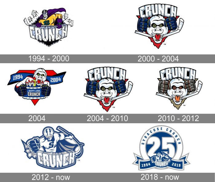
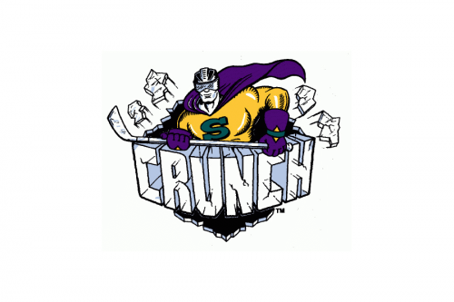
The “Superman” theme made its debut in the team’s first logo adopted in 1994. Here, the Superman (or the Superplayer, to be precise) had a yellow and purple costume with a dark green “S.”
2000 — 2004
From 1999 to 2012, an entirely different logo with an unidentifiable crazy creature was used.
2004
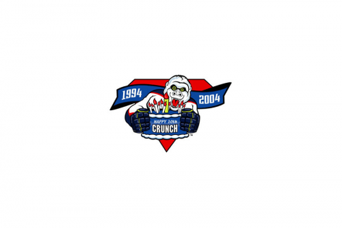
For the tenth anniversary of the club, a new logo was created in 2004. It was the same style and color palette, and, obviously the same main hero, but in this version, the creature was holding a blue and white cake with ten candles on it. The inscription “Happy 10th Crunch” was set directly on the cake, and the “1994 — 2004” datemark in white was written over the blue ribbon behind the animal’s back.
2004 — 2010

A bit more later in the same year, the new primary logo was created. It was actually the same as the badge from 2000, but with the contours cleaned and strengthened. The color palette, lettering, creature, all remained in their places in their style.
2010 — 2012

In 2010 the color palette of the cool and funny badge was switched to a calmer one — with beige and olive-green shades. The red background of the logo was replaced by a sand-brown one, the eyes and globe details on the creature changed their shade from acid yellow to intense and dark orange, when the gloves themselves were now olive-gray, and the tongue of the animal — light orange. With the change of the palette, the whole mood of the badge turned different. This logo stayed with the club for less than two years.
2012 — Today
The team eventually returned to the superhero concept in 2012, although now it looked different, a bit less straightforward than on the original Syracuse Crunch logo.
2018 — Today
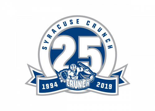
For the 25th anniversary of the hockey club, the new logo was introduced at the end of 2018. It was not even a new one, but an extended version of the primary badge. The blue and white insignia from 2012 was redrawn in a smaller size and placed on a wide blue ribbon with the lettering, set in the bottom of the new emblem. The upper part was taken by a solid blue circle in a wide white outline with an enlarged white “25” in a light gray outline on it.
Colors
The official palette, which looks very discreet, is comprised of four colors: blue, white, silver, and black. Black appears on uniforms only, not the logo. Because of the choice of colors, the logo looks muted and noble.


