Ricola is the name of the European brand of cough pastilles, which was established in 1930 in Switzerland. Today the company’s drops are distributed in pharmacies and supermarkets all over the globe and offer various flavors.
Meaning and history
Ricola is a European brand of natural drops, mints, and instant teas. The products of this Swiss brand, which has been on the market since the beginning of the 1930s, do not contain sugar and are based on natural ingredients. In addition to their distinctive taste properties, the Ricola mints also have an anti-cold and anti-cough effect.
The most well-known product of the brand, mints, has different flavors and active substances, such as mint, cranberry, lemon balm, or herbal collection. The products of the brand have a calming and cooling effect with coughs and wheezing, their composition includes 13 Alpine herbs.The classic Ricola brand product is distinguished by its external appearance and subtle herbal aroma.
Most Swiss people prefer the brand’s products not only as a universal cold remedy but also for daily consumption. Ricola is considered to be one of the most trusted and reputable Swiss brands.
What is Ricola?
Ricola is a European company manufacturer of cough drops and mints, which has recently started to produce herbal instant drinks as well. The company was founded in 1930 in Switzerland, and today it ranks among the most reputable brands in the country.
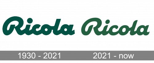
1930 – 2021
The original Ricola badge, created in 1930, was only slightly changed after more than 90 years of use. This bold dark-green logo has become a truly iconic emblem, representing the brand just perfect. The extra-bold title case inscription with the name of the company is set in a custom smooth cursive typeface, with all characters executed in a deep moss-green color. The palette represents the natural composition of the Ricola drops, while the style of the inscription points out such brand qualities as caress and reliability.
2021 – Today
The smooth and sleek Ricola logo is instantly recognizable across the globe and has become synonymous with cough drops of the highest quality. It looks solid and strong, yet at the same time, its bright color palette evokes a sense of reliability and friendliness.
The Ricola logo is composed of a single wordmark, which can be used in several different ways. The main version of the emblem is plain green lettering, executed in an extra-bold custom cursive font with soft and smooth lines and angles. The insignia is usually placed on a white background.
Another version of the logo is the green nameplate in a thin white outline, placed on a bright yellow background. The wordmark also has a very delicate shadow, which adds volume and dynamics to the image. This logo version is usually used on packaging. There are also light green drops packs, which also look great with a bold and solid inscription.
For the web icon, the company uses its iconic letter “R” in Ricola-green color, placed on a white square. The combination of green and white symbolizes growth, health, and life, showing the company’s purpose and reflecting its main values — customers and their wellbeing. When combined with yellow, the logo evokes a sense of energy and progress, being at the same time playful and friendly.


