Campina is a Dutch dairy cooperative, created in 1989 and turned into FrieslandCampina in 2008 after the merger with Royal Friesland Foods. FrieslandCampina has scale in research, production and marketing and local market knowledge in many countries in Europe, Asia and Africa.
Meaning and history
Campina is a brand of dairy products from FrieslandCampina, officially founded in 1979 in the Netherlands. However, the brand name began using Campina much earlier. In 1947 a number of small cooperatives merged to form the De Kempen cooperative association of producers in Eindhoven. It was this cooperative that was the first to use the Campina trademark.
Today the Campina brand produces several lines of food products, namely: Yogurt products Fruttis, Baby formula Friso, Landliebe yogurts, and Campina coffee milk products.
The name of the company is the name of an area in the southern Netherlands, discovered by the Romans 20 centuries ago. Hence the Italian “accent” in the Dutch company.
What is Campina?
Campina is the name of a European food production brand, which was founded in the Netherlands in 1979 and is specialized in dairy products, such as milk, yoghurts and cheese. Since 2008 the brand is owned by the FrieslandCampina group.
1964 – 1979
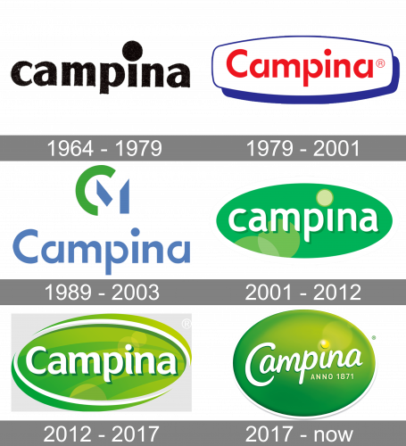
Originally, the logo was a simple black wordmark of the brand. It was written using only the lowercase letters of a rather basic sans-serif font. The only prominent feature was a giant circle in the place of a dot in the letter ‘I’.
1979 – 2001
In 1979, it was reworked into a more modern design. The wordmark now started with a capital letter, and the font turned into a softer, more round style with cuts here and there. The writing was put in the middle of a white octagon plaque with blue outlining and the shadow of the same color.
1989 – 2003

This logo uses the same name inscription, except colored in pale blue. Above it, there is a green half-ring and two strokes of the same shade of blue. These are supposed to look like the letters ‘C’ and ‘M’.
2001 – 2012
The 2001 emblem adopted a new lettering style. These white-colored letters were still soft, but different – and all written in lowercase. The wordmark was then put in the middle of a green oval with several yellowish circles in the bottom left portion, as well as a brighter yellow circle above and to the left of the letter ‘I’ (in the place of a dot).
2012 – 2017
The 2012 logo follows a similar design. The inscription now starts with a capital letter, while the rest utilize a similar, yet slightly updated font. The oval mostly uses a lime shade of green this time, although there are many transparent circles and other shapes that mean illumination. The oval is also surrounded by two green crescents.
2017 – Today
The Campina logo is fresh and bright, it stands for fascination, togetherness and transformation, reflecting the brand’s ambition to get more out of milk by producing food, drinks and ingredients, that help people move forward in life.
Fascination among farmers and employees. Togetherness in a chain between the farmers. Employees, customers and consumers. Transformation stands for possibilities offered by milk.
The pure white center of the logo represents milk and a spectrum of colors around it — the endless possibilities of milk.
The Campina logo shows the importance of milk, as a life-giving resource, which provides many people with energy and enjoyment.
Font and Color
The smooth and elegant lettering from the primary Campina badge is set in a custom cursive font, which is pretty close to such typefaces as Vadelma Variable, or Black Seashore Regular, but with some small modifications of the characters’ contours.
As for the color palette of the Campina visual identity, it is based on smooth gradient tones of green, white for the lettering and a small sunny yellow stroke, adding friendliness and joy to the composition. Green here is a color of nature and purity, emphasizing on the benefits of the brand’s products.


