UnitedHealth Group is a medical care company, established in 1977 in the USA. The organization is one of the world’s leaders in the healthcare and medical insurance segment. The UnitedHealth Group has more than 300 thousand employees and over 100 million customers.
Meaning and history
UnitedHealth Group, a pivotal player in the healthcare industry, was founded by Richard T. Burke in 1977. From its inception, the company has demonstrated a remarkable trajectory, evolving into a multifaceted healthcare giant. Key milestones in its journey include the launch of the first network-based health plan for seniors in 1984 and its remarkable expansion into a comprehensive healthcare management company. UnitedHealth Group’s commitment to innovation and patient care led to significant achievements, such as the establishment of Optum, a health services platform, enhancing the company’s portfolio in technology, data, and pharmacy care services.
Throughout the years, UnitedHealth Group has consistently pursued excellence and expansion. Its acquisition of prescription management and data analytics companies has bolstered its position in the healthcare market. As of my last update, UnitedHealth Group stands as a beacon in the healthcare sector, renowned for its diverse offerings ranging from health insurance to data analytics, pharmacy care services, and technological healthcare solutions. This positioning reflects its ongoing commitment to transforming healthcare delivery through innovative and patient-centric solutions, solidifying its status as a leader in the global healthcare landscape.
What is UnitedHealth Group?
UnitedHealth Group is a diversified healthcare company renowned for health insurance and health services, including technology and data analytics.
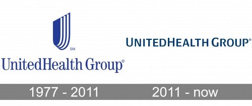
1977 – 2011

The 1977 logo consists of an emblem and a wordmark beneath it.
The emblem depicts a U-shaped shield turned somewhat away from the onlooker. It’s blue with white sides. Plus, there are two more exactly like it, but bigger, stuck to its rear. It’s a double entendre meaning both the letter ‘U’ and a shield (protection). The wordmark is a writing that says ‘UnitedHealth Group’ in blue serif letters.
2011 – Today
The UnitedHealth Group’s visual identity is elegant and sleek. Composed of a wordmark and an emblem, it looks high-end and professional.
The inscription in a smooth sans-serif typeface has “R” and “P” contours open, which adds uniqueness and lightness to the logo. Executed in all capital lettering, the wordmark has “U”, “H” and “G” enlarged. This makes the nameplate look strong and confident.
The dark blue color palette of the logo has been with the company for many years, it is a perfect reflection of trustworthiness and reliability, as well as fundamental approach and expertise.
The previous UnitedHealth Group logo also featured a sophisticated emblem, resembling a three-dimensional crest in halftime-turn. It’s gold and a blue outline made the logo look luxury and powerful.
The current company’s logo is minimalist and laconic, but the lines of the lettering and the proper color makes it look remarkable and fine.


