Reliant Motors was a British automaker specializing in small, three-wheeled vehicles and sports cars. Founded in 1935 by Tom Williams, the company had its roots in Tamworth, Staffordshire, England. Reliant gained fame for its iconic models like the Reliant Robin, a three-wheeler that became a symbol of British eccentricity. The company mainly operated in the United Kingdom but also exported cars to various countries. In the late 1990s, Reliant saw a decline in sales and eventually ceased production in 2001.
Meaning and history
Reliant Motors was established in 1935 in the United Kingdom by Tom Williams. The company specialized in producing unconventional vehicles, notably three-wheelers, and later diversified into sports cars. Located in Tamworth, Staffordshire, the company gained notoriety for its unique design concepts. One of its major milestones was the launch of the Reliant Robin in 1973, a three-wheeled car that garnered a cult following and was even featured in various forms of media, including television shows. Reliant Motors also developed the Scimitar, a sports car that gained considerable attention. The company primarily focused on the domestic market but also had a footprint in exports. By the late 1990s, however, Reliant Motors was struggling with decreased demand and financial challenges. It eventually ceased its operations in 2001, marking the end of its innovative yet eccentric journey in the automotive industry.
What is Reliant Motors?
Reliant Motors was a British automaker known for producing small three-wheeled cars and sports vehicles. Founded in 1935, the company gained fame for its quirky Reliant Robin model. It operated mainly in the United Kingdom and ceased production in 2001.
1935 – 19??
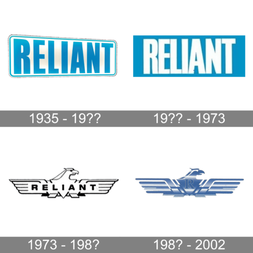
Although this logo was designed almost a century ago, the logo looks stylish and modern thanks to its minimalistic design. The whole emblem appears to be placed at an angle, so the right end seems to be further away. It is done in light blue and white, where the white is used as a neutral backdrop, while the blue is featured in the inscription as well as a thin border. The rounded corners of the rectangular base create a nice contrast to the straight lines of the label. The latter is printed using a bold, sans-serif font and all uppercase characters.
19?? – 1973
The designers used a font similar to Garmint by Maulana Creative or Block Gothic RR ExtraBold. All the lines and cuts were straight and clean. There was one exception – the leg of the “R” was slightly curved at the bottom, which added an interesting touch. Combined with closely spaced characters, the blue rectangular background presented the company as a reliable, solid, and trustworthy brand. The white color added a feeling of perfection.
1973 – 198?
While the earlier versions had a lot in common, this logo looks very different. Besides changing the color scheme to black and white, they added an illustration of a falcon as the base. It spread its wings and was facing right. The bird had very few details, matching the minimalistic inscription across it. The name still featured a clean, bold, sans-serif font, but this time the ends were slightly rounded. This version surely looked grand and bold.
198? – 2002
The logo transitioned into a more stylish and powerful image. The logo was now done in a blue-and-white gradient with a white base. The shape has not changed at all, but the eagle looked very different. There was another major update – the full name was replaced by an enlarged “R” in the center. It was also done in blue but had a very thin white outline that allowed it to stand out. The designers used a serif, bold font. It matched the majestic look of the bird.


