Ramada is a brand of a large UA multinational hotel chain, owned by Wyndham Hotels and Resorts. It was founded in 1954 by Marion W.Isbell and Michael Robinson in Arizona, USA. Ramada has over 800 hotels across 63 countries.
Meaning and history
Ramada Worldwide is an American hotel chain, which belongs to Wyndham Worldwide, a multinational hotel corporation. In addition to Ramada hotels, which numbered more than 800 in the world, Wyndham Hotels and Resorts operates over 9 thousand hotels worldwide. Ramada chain has 105 thousand rooms – 15 percent of Wyndham’s total room inventory.
The name Ramada came from the Spanish language, and can be translated as “Branchy”. In some areas of Spain, the word “Rama” means “A place to stop by the road”.
The year of the foundation of the Ramada chain is 1953, when a few entrepreneurs opened the first motel in Arizona, USA. The name, however, was adopted five years later, in 1959. At the same time, the first franchise to operate a hotel under the Ramada brand was issued.
In 1981, Ramada launched a new brand – Ramada Renaissance Hotels. Soon Ramada hotels operating outside the U.S. were separated into a separate network – Ramada International.
What is Ramada?
Ramada is the name of an American hotel chain, which was established in 1953, and is owned by the Wyndham Hotels and Resorts Group. The first Ramada motel was opened in Arizona, and today the brand owns more than 800 locations in 63 countries across the globe.
1953 – 1979
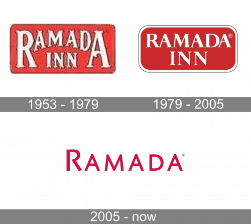
The very first Ramada logo, created for the company in the 1950s, featured a horizontally-oriented rectangular red banner with rounded angles, andheavy white lettering written over it in two levels. The inscription was executed in a stylized ornate font, resembling old American saloons. The top line, featuring “Ramada” was set in a larger size, with the “R” and the “A” enlarged.
1979 – 2005
The redesign of 1979 has modified and strengthened the original version of the Ramada badge, adopting a darker and softer shade of red, adding a white thin framing and a delicate black outline to the banner, and switching the ornate typeface to a traditional and elegant serif font with thick lines, some of the bars arched, and thin serifs on their ends.
2005 – Today

Their first design is exactly as the one that followed, with one exception: the red circle above holds part of the lowercase ‘R’, painted in white. It’s a sort image with a small leaf protruding from its top, making the whole picture look like a plant.
The Ramada logo is bright, stylish and eye-catching, yet quite simple. It consists of a classic style typeface and a round emblem with double R-letter curve.
Despite its classic red-black-white color scheme, the logo looks very modern and confident. The red icon is a very recognizable element and the white R-curves on it are soft and chic.
The current Ramada is the third version of brand visual identity and the most successful. From 1976 to 1982, the chain’s logo was a simple rounded rectangle that read “Ramada Inn” in the original design’s gothic Western-style lettering. From 1982 to 2004, Ramada changed to a revised, rounded rectangular design with more “modern” lettering.
Font and color
The stylish uppercase lettering from the primary Ramada badge is set in a bold and modern sans-serif font with the capital letters of the inaction set pretty far from each other. The closest fonts to the one, used in this insignia, are, probably, Reckless Sans, or Code Pro Demo, but with some significant modifications of the characters’ contours.
As for the color palette of the Ramada visual identity, it is based on an intense shade of pink, with a transparent background, which can be whether white or gold. Pink is the color of passion and tenderness, which also looks very sophisticated and chic, showing the hotels of the chain as welcoming and comfortable ones.


