Quality Inn is a midscale hotel brand owned by Choice Hotels International, Inc., a hospitality franchisor based in Rockville, Maryland, US.
Meaning and history

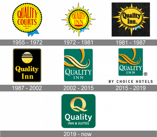
The brand’s roots can be traced to 1939 when Quality Courts United was founded. Initially, it was a nonprofit referral chain of motels in Florida, which consisted of less than ten motels.
1955 – 1972 (Quality Courts)

The logo of this era featured the lettering “Quality Courts” in red inside a yellow circle with multiple triangles, which represented the sun. The emblem was often used as a roadside sign.
1972 – 1981

Although the company was renamed Quality Inns International, it retained its visual brand identity almost the same, to preserve the loyal customers.
Once again, they used the sun as the base of the emblem and placed the arched word “Quality” inside. The old name “Courts” was replaced by “Inn,” and a segment of a solid circle appeared in the lower part of the “sun,” which could be interpreted as a symbol of the sea.
1981 – 1987
An utterly new Quality Inn logo was introduced. It featured the name of the brand in a bold serif font inside a rectangle with rounded corners. The letters were gold, while the background was black.
Although the large circle disappeared, the “sun and the ocean” were still there. You could feel it in the shape of the “Q,” where the “tail” resembled the wave.
1987 – 2002
The sun became explicit, which made the designers change the proportions of the emblem.
2002 – 2015
Once again, the authors of the logo decided to use the resemblance of the letter “Q” and the sun. This time, they placed a large “Q” above the full name of the brand but cropped the glyph to make the “tail-wave” more pronounced.
The palette combining gold (the sun) and teal (the ocean) supported the resort theme.
2015 – 2019
The lettering “By Choice Hotels” in a plain type was added below the Quality Inn logo.
2019 – Today

The “Q” adopted a nobler shade making it look as if it had been made of gold. The glyphs grew cleaner without losing their refinement.


