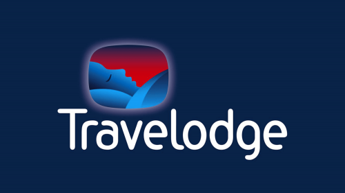
 Travelodge Hotels Limited Logo PNG
Travelodge Hotels Limited is a British corporation which is occupied in building motels and hotels for travelers, especially with children. Founded in the late 70s by Charles Forte, this is the largest UK-based company in this sphere, which since the 70s has built 570+ resting points of budget level and luxury class. Outside the UK, they also have points of presence in Spain and Ireland.
Meaning and history
In the late 70s, an Italian-born Scottish entrepreneur in the fields of hotelling and travelers housing, Charles Forte, bought the assets and trademark rights of US Travelodge Corporation. He did this in an attempt to establish the separate business, operating regionally in the United Kingdom and Europe. The first motel was opened in 1973. Initially, the motels were opened near busy roads, accompanied by cafés, tourist attracting facilities, et cetera.
In 1988, it was merged with another Forte’s hotel business, Little Chef Lodges. The new entity was named Forte Travelodge. Under this name, it would be sold in 1995 to Granada. It decided to build the hotels in the cities and urban areas, with the first such hotel opened in 1997.
In the 2000s, it was sold and resold for several times to different companies. It has also changed its location in 2003, from Toddington in Bedfordshire to Thame in Oxfordshire.
What is Travelodge Hotels Limited?
Travelodge Hotels Limited is a British privately owned company which was established in 1973 and is now headquartered in Thame, Oxfordshire. This is the largest motel company in the UK, which controls around 600 motels across Britain, Ireland, and Spain, employing 11000 workers. thheir target audience are tourists, as well travelers with children. That’s why the motels are often near busy roads, urban areas of cities, and close to restaurants or cafés.
1985 – 1991
With the acquisition of the US branch of Travelodge, Forte received the brand as well. He used the same logotype as the company had previously – the white sans-serif nameplate on the blue rectangle with rounded corners.
1991 -1995
After a while, the new name came up, and the brand designers ought to make a new logo. It featured the ‘Forte Travelodge’ name, depicted in a two-line inscription, whereas the ‘Forte’ surname was uppercase and had something like a crown above it, and the hotel text caption below. All this beauty was on a blue rectangle.
1995 – 2004
After transmission to Granada, the hotel chain bran identity was gained a logotype without the ‘Forte’ word.
2004 – today
The modern 2004 logotype represents the brand’s name, written below an optic illusion reminding a window. There are two visions on what does this illusion show. First, it pictures several mountains and hills, raising underneath a sunset. Second, it’s a wayfarer, wrapped up in a blanket, and laying his head on a pillow.
Color
The logotype’s color code consists mainly of dark blue and its adjoined colors. The name itself is white. It’s put on a dark blue rectangle. The window, contoured gradient white and violet, depicts even darker blue hills/traveler, and upper in the window is the dark red coloring, slightly shifting to dark blue.
Font
The nameplate has a sans-serif style, with the first ‘t’ capitalized and the following letters lowercase. The font is minimalistic, it has rounded tips of the letters, and there are small intervals between them.


