Best Western is an American hotel-chain, which was established in 1946 and today has over 4 thousand of hotels across the globe, half of them in the USA and Canada.
Meaning and history
From the motels operating company to a world’s famous hotel chain, the Beat Western brand has had a pretty intense and successful history, and so did its logo, which evolved from a simple boring badge to something contemporary and sleek.
What is Best Western?
Best Western is the name of an international hotel chain, which was established in the middle of the 1940s in the United States. Today the company successfully operates worldwide, managing more than 4 thousand properties across the globe, with over two thousand of them in North America
1946 – 1950
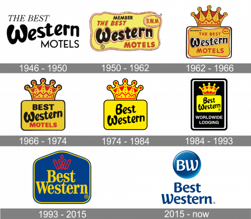
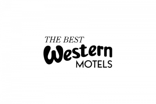
The very first logo for the Best Western hotel chain was introduced in 1946 and stayed with the brand for four years. It was a monochrome banner with an enlarged black “Western” written in a custom rounded font, between uppercase “The Best” in a slanted serif, set above it, and the “Motels” in the modern sans-serif font, placed at the bottom of the logo.
1950 – 1962
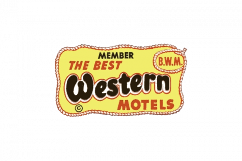
The initial badge, designed for The Best Western Motels, comprised a smooth rectangular frame with bold blue lettering inside. The “Western” part of the nameplate was emboldened and placed in the middle of the emblem, being surrounded by smaller lettering from up and down.
1962 – 1966
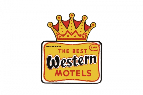
In 1962 the logo was redesigned to make the brand more recognizable and stand out in the list of competitors. The new emblem featured a bright yellow rectangle with a yellow and red crown on top. The wordmark was set on a yellow background in red and brown, with the “Western” parts emphasized again.
1966 – 1974
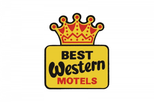
The name of the company changed to “Best Western Motels” and the logo is being redrawn in 1966. The lines of the crown became more rounded and wide, and the letters of the inscription were cleaned and strengthened. As for the color palette, it remained the same, but the yellow gained a lighter shade.
1974 – 1984
The “Motel” part was erased from the company’s name in 1974. The new logo fully repeated the colors and composition of the previous one, but the wordmark was now set in dark brown and executed in a smooth custom typeface with both parts equal in size.
1984 – 1993
The redesign of 1984 placed the yellow emblem with the crown on a vertically oriented black rectangle with a double white and black outline and rounded angles. Under the yellow icon, there was a white sans-serif “Worldwide Lodging” tagline written in big capitals. The brown color of the main inscription was changed to black to balance the look of the image.
1993 – 2015
The logo, created for the brand in 1993 was something new — a yellow serif inscription placed on a bright blue geometric background with a yellow and blue outline. Above the logotype, there was a contoured stylized crown in thin red lines, drawn resembling a letter “W”. This emblem still can be seen in some company’s locations.
2015 – Today
The redesign of 2015 changed the style of the Best Western visual identity again. The new lettering is executed in a smooth and sleek custom typeface with the ends of the letters curved and looking fancy and playful. As for the emblem, it is composed of a glossy blue circle with the white “BW” in the same typeface on it. The dark and calm blue color palette of the refreshed logo evokes a sense of stability and comfort, showing the company as a reliable and professional one.
Font and color
The bold and smooth title case lettering from the official Best a western logo is set in a fancy elegant typeface with slightly curved tails of the letters. The closest fonts to the one, used in this insignia, are, probably, Costa Std Bold and Caturrita Medium, but with contours of some letters modified.
As for the color palette; the international hotel chain chooses a clean and professional combination of blue and white, a scheme, that evokes a sense of reliability, stability, and trustworthiness. It also looks timeless and very professional.


