By the late 1930s, Publix Super Markets, a fairly large retail chain that would very soon become a true market giant, had started up across America. Today, Publix is the seventh largest private company in the United States with revenues of $27.5 billion. One of America’s largest regional grocery chains, Publix has a simple yet recognizable logo. The rounded letters have a fun and inviting style, and the right choice of color makes the customers trust the brand. By the way, green is most often associated with money and wealth, and Publix uses this shade to ensure customers have the best deals with the chain.
Meaning and history
The Publix chain of Super Markets is a large company, based in Florida, USA, and is considered to be the largest company in the region. The founder of the corporation was George W. Jenkins. The first market, which marked the beginning of the future Publix Super Markets chain, opened on September 6, 1930, in Florida. The second store, the Economy Food Store, was opened as early as 1935 in the same community as the first.
Publix is the most profitable grocery store chain in the entire country and the seventh largest privately held company in the U.S. with 27.5 billion USD in revenues and one of the least publicly traded firms. And it’s the largest company in America, owned by those who work at it.
What is Publix?
Publix is the name of an American chain of supermarkets, which was established at the beginning of the 1930s, and today has grown into a chain of more than a thousand locations across the country. Publix is a private and employee-owned company, which makes it stand out in the list orbits numerous competitors.
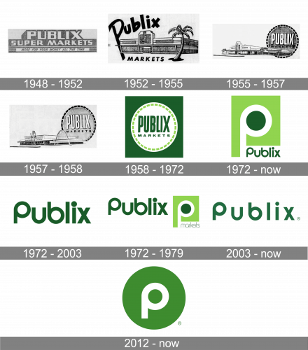
1948 – 1952
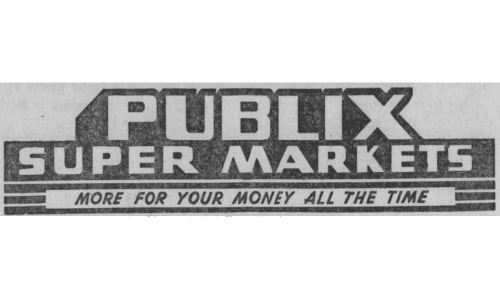
The original Publix logo was a combination of blocky letters placed as if at an angle. This writing said ‘Public Super Markets’ in white characters, outlined with black. In the base of this structure, the motto ‘more for your money all the time’ was written in the normal black letters.
1952 – 1955
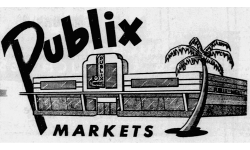
The next emblem displays an image of a building – the usual Publix supermarket from those days. Above, they wrote the word ‘Publix’ in an illustrative, black font, while ‘Markets’ was written in a more mundane way right beneath. The entire logo was black-and-white.
1955 – 1957
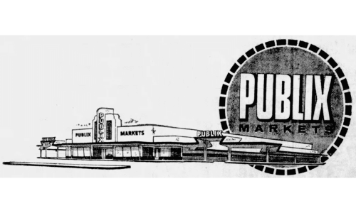
In 1955, they extended the building to have a parking section on the right. The biggest addition was a circle with ‘Publix’ written in big, white letters inside + ‘Markets’ in smaller, black characters right below.
1957 – 1958
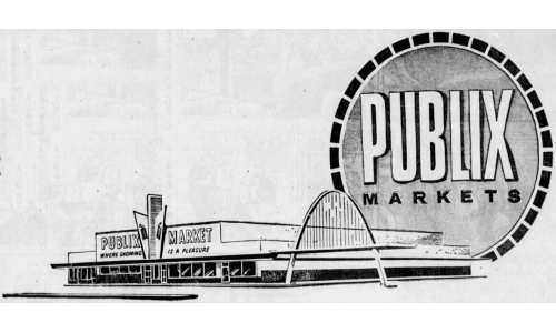
In 1957, the building bit was changed marginally, and they also elevated the round name frame a bit. Nothing else changed substantially.
1958 – 1972
The first Publix Food Store started working in Winter Haven, Florida, in the fall of 1930. For the first four decades of its existence, the company used a logo that looked nothing like the current one.
The original Publix logo showcased the name of the brand in a sans serif type. The glyphs were bold and had elongated proportions. The word “Market” below was also given in a sans, but it had more traditional proportions.
The wordmark was placed inside a circle with a dashed line going around its border. This peculiar trim gave a unique touch to the otherwise generic logo.
1972 – Today
This is when the era of the rounded “P” and the green color started. In addition to being the initial of the brand’s name, the letter also looked like the road. The white rectangle in the lower right corner could be interpreted as a parking lot near the supermarkets of the chain. So, in a way, the Publix logo was a kind of a welcoming sign for those who were passing or driving by.
The original design showcased the “P” in white with a dark green filling and light green background. In the lower right corner, there was the word “Publix” in dark green. The “P” in the brand’s name was the same as the large one, while all the other letters echoed its shape. The “b” looked like an inverted “P,” while the dot above the “i” was larger than usual, which emphasized its similarity to the green circle inside the “P” emblem.
The use of the green color can be partly explained by the fact that around 90% of the stores include a pharmacy. The subliminal “promise” of natural products is also part of the green color.
1972 – 2003
In the same year, they also adopted a secondary logo, which was just the word ‘Publix’ as written in the previous design, but bigger.
1972 – 1979
The second additional logo used the same wordmark, but used the square bit from the main design (except the ‘Publix’ word was replaced with ‘Markets’ in it.
2003 – Today
In 2003, another additional logo was introduced. It was the same wordmark, but with bigger gaps between the letters and a much lighter shade of green.
2012 – Today
The “P” is used both by itself and together with the full wordmark.
The type featured in the Publix logo has glyphs similar to the Opificio Bold and Sinn Bold fonts, although they are not the same.
Symbol
Upon comparing the wordmark with the Opificio Bold font, you may find out that they look very close, especially the “u” and the “b.” Another type that is pretty similar in style is Sinn Bold. This font was developed by Alec Julien and published by Haiku Monkey.
However, these types haven’t been taken as they were. For instance, the “P” is completely different from the respective glyph of the Opificio Bold type. On the Publix logo, the capital initial looks by far friendlier due to its rounded shape.
Emblem
While this logo is just a wordmark without any pictorial elements, there’s an interesting graphic effect to it – the word seems to have been broken into two parts. Each of the parts differs in style. The letters “Pub” have a rounded structure and are based on a circle shape. On the whole, they have a rather friendly style. The lettering “lix” is edgier and slimmer.
And yet, each of the two parts has some elements that connect it to the other part. You may notice that the ends of all the letters aren’t rounded. Also, the dot on the “I” is rounded.
As the company hasn’t given any explanations regarding this logo, we can’t say for sure whether the effect results just from the fact that the letters “p,” “u,” and “b” are rounded in themselves or whether the contrast has been used on purpose.
Font
As we’ve mentioned earlier, the font featured on the Publix logo is pretty similar to Opificio Bold. This is a sans serif type developed by Andrea Cerboneschi and published by Monofonts. It’s one of the most popular fonts introduced by this type foundry. Opificio is a geometric sans serif font created for an artisanal workshop Opificio JM based in Prato, Tuscany, Italy. The design was developed in collaboration with John Malkovich.
Colors
Green symbolizes nature and safety. This seems to go well with the GreenWise Market retail concept and the fact that around 90% of Publix stores have a pharmacy.
What does the Publix logo mean?
The laconic yet bright Publix logo depicts a stylized white letter “P” on a solid green background. Apart from the name of the grocery store chain, the letter also represents a ring road and parking around the stores of the brand. The green and white color palette of the Publix logo stands for fresh products and high quality.
What is the Publixmotto?
The motto of the popular American chain of grocery stores, Publix, is “Where Shopping is a Pleasure”. It was adopted in the middle of the 1950s and is still super actual for the company, which develops and grows, trying to do its best for the customers to enjoy the shopping experience.
When did Publix change its logo?
Throughout the years, the American chain of grocery stores has had ten official badges, with the first logo introduced in 1948, and redesigned in 1952. Since then the badge was constantly refined and rethought, with the latest redesign being held in 2012. The current version of the logo is based on the Publix badge, designed for the company at the beginning of the 1970s.
What color is the Publix logo?
The logo of the Publix grocery chain has been using green color as the main one since the end of the 1950s. This fresh and calming shade evokes a sense of confidence in the products, sold in the chain’s stores, and shows the brand’s focus on the freshness of foods. The current Publix badge uses an intense and medium-dark shade, which also reflects such qualities as professionalism and trustworthiness.


