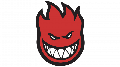
Spitfire is the name of a skateboard clothing and accessories brand, which was established in 1987, and by today has grown into one of the most iconic labels in the world’s street subculture and fashion. The brand started with the production of the wheels for skateboards, and today offers a full range of products from accessories to clothes.
Meaning and history
Spitfire is not just another label, it is truly a legend in the skateboarding world. The brand, known for the most reliable wheels for skateboards, has also one of the strongest skateboarding teams, consisting of the most reputable and famous names in the sphere.
Although the brand gained its popularity due to the super technological approach to the production of the wheels, produced of special urethane, which formula varies depending on the type of the skateboarding the wheels are going to be used for, and the ground the skateboard will mostly be riding on, Spitfire is also known for a bright and stylish collection of clothing and accessories.
The fashion collections of the brand can be worn both for skateboarding, and casual street style outlooks. The bright t-shirts, shorts, and socks of the brand all feature recognizable designs and vivid color palettes, with the most garments decorated by the iconic logo of the brand, which was designed for Spitfire at the very beginning of its history.
What is Spitfire?
Spitfire is a skateboard-related brand, which was established in the United States at the end of the 1980s. The brand is known not only as the manufacturer of the best wheels for boards, clothes, and accessories but also as one of the strongest teams in the world’s history of the skateboarding subculture.
As for the visual identity, Spitfire has always been loyal to its original badge, designed for the brand at the end of the 1980s. The emblem with no additional lettering could only change its colors through the years but has always been executed in one palette: from orange to red, whether flat or gradient.
1987 — Today
The Spitfire logo, created for the brand at the end of the 1980s, has never been changed, and today can truly be called an iconic one. The gradient orange (or red, depending on the placement and the needs of the brand) flame in a thick black outline has a face with a wicked mocking grimace. The wide white smile looks more dangerous and scary than friendly, and the triangular shape of the teeth supports and balances the triangular flame “hair” of the emblem.
The style and colors of the Spitfire badge are not only about the name of the company, but also its character and determination to everything connected with the skateboarding subculture.
Font and color
The primary version of the Spitfire logo has no inscription on it, just the graphical part, executed in a gradient orange and black color palette with one small white detail, for the face of the brand’s signifier, the Flame. The shades of the logo represent the energy and power of the brand, and brilliantly show its young character, target audience, and mood. Orange and red are also colors, standing for passion and motion, and in the Spitfire context, it makes sense.


