

![]() Hamilton Logo PNG
Hamilton Logo PNG
The poster of the musical Hamilton is now a coveted pop culture symbol by itself. Let’s dive deeper into its symbolism and design features.
Meaning and history
![]()
The musical premiered on January 20, 2015, in The Public Theater in New York City. The theatrical sensation tells the story of the American Founding Father Alexander Hamilton. As of June 2019, tickets were sold for up to $1,800.
2015
![]()
The first emblem for the musical was presented in 2015 and attracted attention with its bright yellow color. For the background of a catching tagline, the designers used a graphical half-turned portrait of Hamilton himself. Aligned to the right, the inscription said “Who Lives, Who Dies, Who Tells Your Story” in four lines alternating bold and regular italicized font. The white lettering had a black background for a drastic effect. Centered across the bottom, the emblem had the name of the musical printed in large, sans-serif, italicized letters of a black color.
2015 – now
![]()
This iconic logo was created the same year as the previous one. Hamilton here is a true star. His silhouette is drawn in a standing position with one of his hands raised and pointing up in the sky, his jacket being blown to the side, and his legs confidently positioned widely spaced apart. This silhouette further serves as the upper point of the five-point star. The latter has “Hamilton” printed in uppercase white letters with serif and “An American Musical” added underneath in smaller font.
Emblem
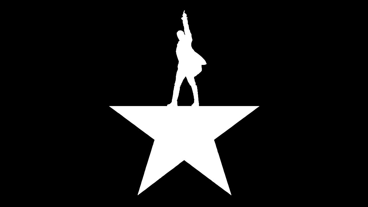
The Hamilton logo depicts the main hero, Alexander Hamilton, standing in a triumphant pose on a star with its top point cut. In other words, the man’s silhouette stands in the place of the missing point.
Versions of the symbol
This type of logo can be easily adapted to various backgrounds – the feature often used to create special versions of the poster.
You can also find a series of posters that were rejected and didn’t make it out to Broadway. They were published in the book On Broadway: From Rent to Revolution (2016).
One of the versions features just an ink stain, which can be broken down into meaningful elements with the figure of Hamilton in the center. Moreover, there is also another ink stain version, which features only Hamilton’s head. The book also includes a poster showcasing a black feather on the red background and a poster with a hand holding a feather. You could also see several versions sporting the letter “H” in different styles: a retro style “H”, an “H” made up of golden dust and written with the help of spray paint.
On the whole, we can say that the final version appears to be a perfect balance between the number of details and implied meaning.
Font
![]()
The official poster combines two absolutely different types. To begin with, the one used for the second line looks more elongated and is a sans serif font, while the letters of the first line are broader and belong to a serif font.
The word “Hamilton” probably features the Trajan font. The type known for its retro elegance was developed in 1989 by Carol Twombly for Adobe. As for the second line, it appears to be based on the Gotham Bold Condensed typeface.
On the whole, both types provide excellent legibility. We can assume that an old style serif font was used for the name of the main hero to fit the plot of the musical, which is set in 18th-century America.
Colors
![]()
The palette of the Hamilton logo is built upon the combination of gold and black with white accents. Due to the gradient effect, the poster features various shades of gold, from rather dark and gloomy, to light semi-transparent ones.


