Hertz is the name of an international car-rent company, which was established in 1918 in the United States and today operates all over the globe through more than 30 thousand of its offices. The yearly revenue of the company is almost 10 billion USD.
Meaning and history

Hertz was founded on September 22, 1918, when Walter Jacobs decided to open his own business in Chicago, USA. In order to do so, he bought several used Model T Ford cars and restored them to their proper condition.
The short-term car rental service became in demand. The company grew, and five years after it was founded, John Hertz decided to join it. This new co-owner gave the car rental firm a new name, Hertz Drive-Ur-Self System, and introduced the signature black and yellow color that is still a staple of Hertz’s visual identity today. Sometime later the company name was changed to The Hertz Corporation.
In 1932, the first car rental station opened at the Chicago airport. At the same time appeared the first overseas rental station in Canada. In 1926, the controlling stake in the company was owned by General Motors Corporation, in 1953 it was bought by Omnibus Corporation.
Over the past 30 years, Hertz has made extensive use of the latest technology. In 1984 a sensor system Computerized Driving Directions appeared in rental cars to help choose the best route, and since 1995 Hertz cars in the U.S. use the Never Lost onboard navigator.
What is Hertz?
Hertz is the name of an American car rental service providing company, which was established in 1918, and today operatesacross the globe, through more than 10 thousand offices in over 150 countries on all continents.
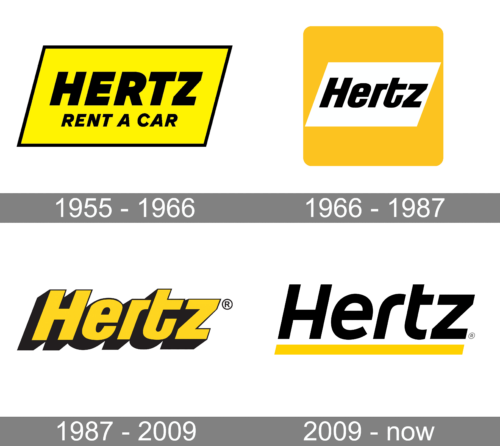
1955 – 1966

The very first sheets logo featured a simple yet bright and memorable badge, where the black lettering with a tagline was placed on a bright yellow background and enclosed into a thin black frame, repeating the shape of a parallelogram, with the sides slanted to the right. The logotype was set in the uppercase of a bold italicized sans-serif typeface, while the “Rent a car” tagline used a simpler and thinner font.
1966 – 1987
The redesign of 1966 has modernized the composition of the Hertz logo, switching the shade of yellow to a smoother and darker one. The new concept was based on a yellow square with rounded angles and a white parallelogram in the center. The parallelogram featured a bold black wordmark in a slightly narrowed geometric sans-serif font with italicized title case characters.
1987 – 2009

The redesign of 1978 simplified the Herts logo to a single logotype, which was now set in an italicized extra bold sans-serif typeface in yellow, with a thin black outline and the thick black shadow of every letter. The new title-case inscription looked smooth and friendly, while the bright color palette added a sense of power and professionalism to the whole look.
2009 – Today
The visual identity of the international car rental service is simple yet instantly recognizable not only in the United States, where it was founded but all over the globe, where the company has its offices today.
The Hertz logo is composed of an underlined wordmark and uses just two colors — black as a main, and yellow for an accent. It might seem too simple and usual, but something in this inscription makes it remarkable and unique.
The sans-serif typeface of the Hertz logotype is modern and confident. Its italicized letters feature bold smooth lines with straight and distinct cuts, and the sharp angles of the last “Z” add a sense of power and professionalism.
Executed in a title case, it doesn’t look boring or too official, and the thick yellow underline only adds a dynamic feeling, showing the energy and progressiveness of the company.
The black and yellow color palette, which is usually used in combination with white, is a representation of professionalism and trustworthiness, along with vitality and friendliness, as the company works for people and providing its clients with comfort is the main priority for Hertz.
Font and Color
The bold title case lettering from the iconic Hertz badge is set in a modern sans-serif font with italicized full-shaped characters. The closest fonts to the one, used in this insignia, are, probably, Jiho Bold Italic, or HongKing Medium Italic, with some minor modifications of the contours.
As for the color palette of the Hertz visual identity, it was adopted by the company in the first part of its history. The combination of red and yellow elements, set against a plain white background, represents the globally-trusted car rental company as a professional, reliable, and strong one.


