Portaro is an automotive brand focused on producing off-road vehicles, particularly 4×4 SUVs and light trucks. Originating from Portugal, the company was a collaborative project involving several entities, including the Romanian ARO and the Portuguese automotive manufacturer, MV Mecânica. Operating mainly during the late 1970s to the early 1990s, Portaro had a strong presence in its home country of Portugal and expanded its market to various European countries. The company, however, gradually faded in prominence and ceased its operations.
Meaning and history
Founded in the late 1970s, Portaro was a joint venture involving MV Mecânica of Portugal and ARO from Romania. The company specialized in manufacturing off-road vehicles such as 4×4 SUVs and light trucks. Among its notable achievements were the production of the 240 series, which garnered a loyal following among off-road enthusiasts. With vehicles designed for both civilian and military use, Portaro carved a niche for itself in the automotive industry. Active primarily in Portugal, the company also extended its reach to other European markets. However, despite its innovations, Portaro faced challenges that led to its decline, ultimately ceasing operations in the early 1990s. As of the last available information, the company no longer produces vehicles and is considered a piece of Portuguese automotive history.
What is Portaro?
Portaro was a Portuguese automotive company specializing in the production of 4×4 SUVs and light trucks. Founded as a collaboration between MV Mecânica of Portugal and Romanian company ARO in the late 1970s, Portaro operated mainly in Portugal and parts of Europe. The company ceased its operations in the early 1990s.
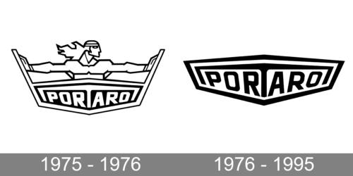
1975 – 1976
The logo of the brand looks quite surprising with a Superman-like character drawn above the name. The man faced his left and pushed the sides as if opening the doors or preventing a fortress from collapsing. It was a perfect symbol for powerful vehicles that were not afraid of bumpy roads or any other obstacles in their way. The name was printed using a bold, sans-serif font of a white color that contrasted well against the black background. To add even more interest to the logo, the inscription was placed at an angle making the center appear closer.
1976 – 1995
This logo was used for almost twenty years until the company ceased to exist. If you compare this version with the original, you will see, that the company simply removed the drawing of a Superman and modified the border slightly to make the inscription and the background a standalone emblem. It should be noted that the colors were inverted, so the inscription was now black on a white background, which was a great modification. The black and white color palette made the logo not only look professional but also suitable for a brand that made strong off-road vehicles.


