The celebrated hockey team was established in Pittsburgh in 1967. Though, the first ice-hockey club came off in the city at the end of the 19th century, along with the first synthetic ice cover, only with the birth of the Pittsburgh Penguins the region became popular for its sports activities.
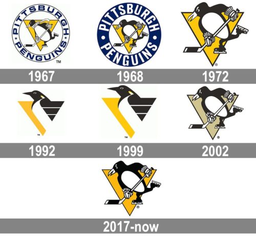
For most of its history, the ice hockey team Pittsburgh Penguins has used a logo built around one and the same core image – a skating penguin. The only exception has been the decade from 1992 to 2002. The symbol that has been present in each logo version, without any exceptions, is a gold triangle.
Meaning and history
Pittsburg Penguins is one of the most titled teams, playing in the National Hockey League. It has won the Stanley Cup 5 times, which is a pretty impressive result. The club has also 6 trophies for Conference championships, one President’s trophy, and 9 wins in the Division championships.
The member of the Metropolitan Division of the Eastern Conference has played in the Civic Arena until 2010 and now moved to PPG Paints Arena. Pittsburgh Penguins is managed by Ron Hextall and has Mike Sullivan as the head coach.
What are Pittsburg Penguins?
Pittsburg Penguins is the name of a professional ice-hockey club from the United States, which was established in 1967, and today successfully competes in the National Hockey League. The club, owned by Fenway Sports Group, has PPG Paints Arena as its home ground, and Mike Sullivan as the head coach.
1967 — 1968
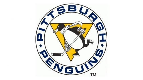
The very first logo for Penguins was designed in 1967 and hasn’t changed much since that time, as was a perfect combination of symbols and meanings. The logo was composed of a yellow triangle, pointing down, and a white-and-black penguin in ice-skates and with a hockey stick. Another feature of the team said the symbol was the long waving scarf.
The yellow, or gold triangle was a tribute to the team’s mother-city, as its downtown was nicknamed the Golden Triangle.
The emblem was enclosed in a double circle frame, with a blue wordmark placed around its perimeter.
1969 — 1971
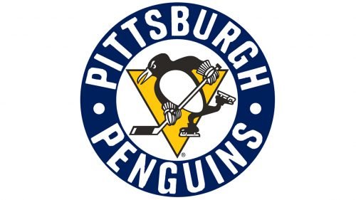
The Skating-Penguin was redesigned in 1969. Its contours became more geometric and modern and the scarf was gone. The frame of the emblem was enlarged and now featured blue color with the white lettering around it.
1972 — 1992
With the redesign of 1972, the round frame was removed from the emblem, and now the black and white penguin was placed on a yellow triangle, without any additions. It was a strong and contemporary emblem, which is still used by the team today.
1993 — 2002
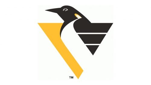
In 1993, after the Pittsburgh Penguins won two Stanley Cups, they decided to redesign their logo and hired Vance Wright Adams and Associates design bureau. The new logo kept the color palette and the idea of the original version but was drawn in a completely different style, looking sleek and elegant.
It was a yellow triangle with the penguin’s head coming out of it. The penguin was facing left and had its beak elongated and pointed.
The upper right part of the triangle was colored black, resembling a penguin’s wing, and featured two thin horizontal lines in white, which added a geometric pattern, making the whole image unique and modern.
This logo stayed with the hockey team for almost ten years and was a perfect representative of the strong American club.
2003 — 2016
In 2003 the team comes back to the visual identity interpretation of 1972, though changes the color scheme to a more pale one. It is still a black, white, and yellow combination, but yellow is in its very light shade, close to calm beige. The skating penguin itself wasn’t changed much, just its contours were refined.
2017 — Today
In 2017 the logo comes back to its original intense color palette. The bright yellow is back and looks great on the uniform and printing materials.
The mixture of the black, white, and yellow evokes a sense of energy and happiness, showing the professional ice-hockey team, which is passionate about what it does. The color scheme makes the logo eye-catching and memorable, while the composition of the logo is a celebration of the team’s roots and legacy.
Font
The current wordmark based on a custom type features the word “Pittsburg” in black on the top, while the lettering “Penguins” in black and gold is placed below. It was adopted in 2017. It doesn’t differ much from its predecessor used in 2009-2016, except for a subtle color shift.
Colors
BLACK
PANTONE: BLACK C
HEX COLOR: #000000;
RGB: (0,0,0)
CMYK: (75,68,67,90)
GOLD
PANTONE: 4535 C
HEX COLOR: #CFC493;
RGB: (207,196,147)
CMYK: (6,8,35,12)
YELLOW
PANTONE: 1235 C
HEX COLOR: #FCB514;
RGB: (252,181,20)
CMYK: (0,31,98,0)
WHITE
HEX COLOR: #FFFFFF;
RGB: (255,255,255)
CMYK: (0,0,0,0)


