

![]() Stanley Cup Logo PNG
Stanley Cup Logo PNG
The Stanley Cup is a hockey trophy given to the winners of the NHL playoffs each year. The history of the cup began in 1889 when the city of Montreal hosted a local hockey tournament. During the game, the Governor General of Canada, Lord Stanley Preston, was invited as a fan. He enjoyed the game so much that he decided to pursue its development in Canada.
Meaning and history
![]()
To award the best hockey team in Canada with a special prize was invented by the Governor General of Canada from 1888 to 1893, Lord Stanley Preston, who was conquered by the Canadian variety of soccer popular in England.
March 18, 1892, was established the Governor’s Cup among amateur teams, called the “Challenge Cup” from 1910 – professional clubs of the NHA and the best clubs of the professional league of the Pacific Coast (then merged into the League of Western Canada), since 1927 – only NHL clubs. The prize was an ornate silver bowl purchased personally by Stanley Preston in London for 10 guineas (approximately $50).
Stanley Preston himself was recalled to England 10 months after he came up with the award, having never seen a single match for the Cup named in his honor.
Preston’s idea was that hockey players who won the Cup had the right to have their team name engraved on it. A few years later, it was considered fair to immortalize the entire winning team by name on the Cup. To this end, several silver rims were added to the vase from below.
At one point it became clear that it was impossible to increase the size of the Cup indefinitely, and since 1991 the hoops of the Cup were replaced with new ones as needed, and the old ones were sent to a place of honor in the NHL Hockey Hall of Fame.
In 1964, to preserve the cup, a replica was made by jeweler Carl Petersen. It is the one that has been awarded to the winners ever since. By the way, each hockey player who won the Cup has the right to take it home for one day.
Today, the Stanley Cup is one of the most prestigious sports trophies in the world. A copy of the vase, bought by an English lord in London, is the dream of every self-respecting hockey player.
The formula of the draw has changed many times, but most often a series of matches up to 4 wins was envisaged. In recent years, 16 best (based on the results of the regular season – championship) NHL teams have participated in the Stanley Cup.
What is the Stanley Cup?
Stanley Cup is the name of a hockey trophy awarded annually to the winner of the National Hockey League (NHL) playoff series. It is a silver vase with a massive cylindrical base weighing 14.5 kilograms and almost 90 centimeters high. The cup received its current name in 1910 as a trophy among professional teams; since 1927, the Stanley Cup has been the NHL’s top prize.
In terms of visual identity, for most of the championship’s history, its logo has been based on the original design, with some modifications. However, at the beginning of the 2000th, the concept of the badge was significantly changed.
1989
![]()
The Stanley Cup logo, introduced in 1989, depicted the main hockey trophy on a blue and black roundel with a wide white frame and a wavy red ribbon at the bottom. The date was set under the ribbon, and the name of the competition — on it.
1990
![]()
For the championship of 1990, the design concept of the logo remained the same, but the colors got slightly lighter, which made the whole badge more contrasting and distinctive. The Stanley Cup was drawn with more details and shadows.
1991
![]()
In 1991 the Stanley Cup on the logo got a bit bigger, and the shades switched to dark ones again, adding depth to the image and accenting more on the trophy, as it was executed in light colors.
1992
![]()
The lettering became more readable and distinctive on the Stanley Cup logo in 1992. The shades of blue and red got a bit alternated again, adding more air and light to the overall composition.
1993
![]()
The centennial Stanley Cup logo was designed in 1993, and it was fully based on the previous badges of the hockey championship. The red ribbon here was wider and had its ends straight and more geometric, than the narrow wavy ones from the 1980s.
1994
![]()
In 1992 the Stanley Cup logo got back to the design from 1992, repeating all shapes and shades of the badge. It was the last logo of this series and in this scheme. This light tone of blue will only come back at the beginning of the 2000s.
1995
![]()
The badge, created for the Stanley Cup in 1995 was in the same circular shape with the ribbon at the bottom, but the new color palette was adopted. The background was set in black and orange, while the trophy was drawn in silverfish gray, and has an orange and black NHL badge on it.
1996
![]()
The blue ribbon became brighter in 1996, with the two leveled lettering in white and orange looking more readable and contrasting. The trophy also got brighter, as well as the date of the championship on the sides of it, set in the same shade of blue as the ribbon.
1997
![]()
For the championship of 1997, the color palette of the Stanley Cup visual identity was changed to black and red, with the blue ribbon becoming a bit shorter. The “Championship” lettering was removed from the composition, so the name of the tournament was now larger and bolder.
1998
![]()
The red on the logo turned dark orange in 1998 both on the background and on the letter outlines. Although all other elements remained absolutely the same as on the previous badge.
1999
![]()
The intense red came back to the Stanley Cup logo in 1999, fully repeating the design, introduced in 1997. It was the last badge using this design concept.
2000
![]()
The new era of the Stanley Cup visual identity started in 2000. The black of the background turned orange, while the rays around the famous trophy got white, creating a fresh and bright composition. The NHL badge moved to the bottom of the logo.
2001
![]()
The 2001 Stanley Cup badge was exactly the same, with no changes except for the date, written on the sides of the blueish silver trophy in narrowed yet bold blue digits with a thin white outline.
2002
![]()
All orange elements got a bit more intense compared to the previous logo. And with these slight alternations, the whole logo started to look more confident and professional.
2003
![]()
The redesign of 2003 has played a bit with the lettering around the Stanley Cup logo’s frame. The characters became a bit smaller, and the orange outline became more visible. The inscription of the ribbon was also refined, making up a more voluminous image.
2004
![]()
The last logo of this design was introduced in 2004, with the shade of orange coming back to its lighter form. Everything else remained untouched, but the date seemed more geometric.
2006
![]()
The blue, red, and gray color palette came back to the Stanley Cup visual identity in 2005, but the design concept of the logo was dramatically changed. Now the main badge was in the shape of a crest, with the trophy drawn on its top part. The Cup looked very realistic and voluminous. The name of the championship was written in bold blue capitals with a white outline, accompanied by two narrow ribbons — red and blue — with the “Eastern” and “Western” wordmarks on them.
2007
![]()
In 2007 the light gray background of the crest turned white, which accelerated the contrast of all logo elements. Both shades of blue — of the inscription and the ribbon — were alternated, and the red got brighter. The accents on the trophy also got darker and more visible.
2008
![]()
The new version of the Stanley Cup logo was introduced in 2008. The crest became more geometric and sharp, changing its main color to bright blue with delicate gradients. The trophy was placed on top of it, and accompanied by a bold slanted wordmark in white with a double blue and black outline. The black and gray NHL badge was placed at the end of the inscription. The uppercase “Final” in thin white lines was written at the bottom of the crest.
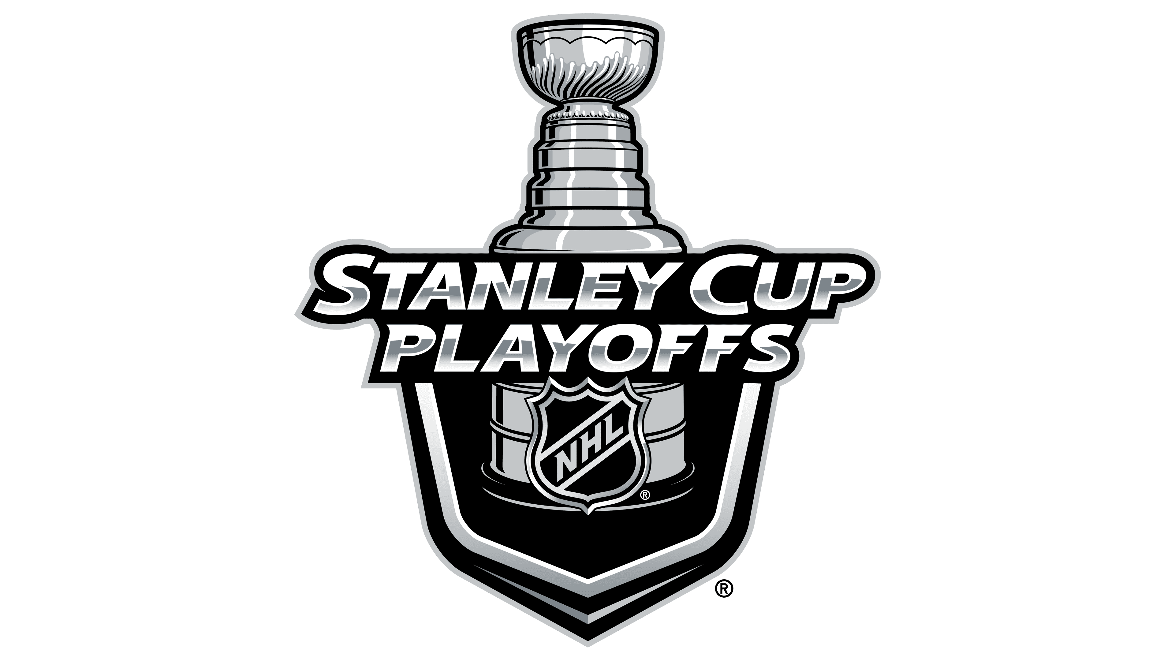
2009 – 2020
![]()
The new era of the Stanley Cup logo started in 2009, and since then only the badge of the teams, playing in the Finals have been changed. The basic composition was formed by a glossy silver trophy with the small “Stanley Cup” lettering placed above the enlarged geometric “Final”, all in silver with a black outline. Under the wordmark, there is a narrow arched ribbon with the date of the tournament and six black five-pointed stars. The black and gray NHL badge moved to the very bottom of the logo.
Font and color
The three-dimensional lettering from the Stanley Cup logo is set in the uppercase of a slightly italicized geometric font with small sharp elements on the top of the characters. This is a custom designer typeface, which has somewhat in common with such commercial types as Bonega or Birthy.
As for the color palette of the Stanley Cup visual identity, it is based on just two shades of— glossy silver and black, which make up a perfect base for the bright and interesting emblems of the hockey teams, that take part in the championship’s final.


