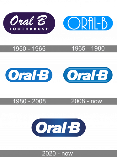
While the basic structure of the Oral B logo has not changed that much since 1950, the type and the palette have been modified not less than four times.
Meaning and history
The history of the Oral-B brand dates back to 1949. The creator is considered to be Robert Hutsan, a dentist. He noticed that patients often complained that their gums were bleeding, and this was causedby the low quality of the toothbrushes. The fact is that in these years they were made of stiff bristles. The doctor decided to replace the fibers with softer ones, and that’s how the brand of oral care products that is now known around the world was born.
What is Oral-B?
Oral-B is the name of an internationally famous brand of dental care products, which was established in the United States at the end of the 1940s, and today is owned by Procter & Gamble, with its products distributed all over the globe.
1950 – 1965
The lettering “Oral B” features a script inspired by handwriting. You can see the word “Toothbrush” below. This writing is made from typical sans serif letters, spread far from one another. The background for the words is a large violet oval.
1965 – 1980
The elliptic shape is preserved, but it grows much lighter. The handwritten script is replaced by a simpler type. It is very thin and light. The letters have various sizes and lengths. The oval was colored bright blue.
1980 – 2008
The wordmark grows much bolder and is italicized. The shade of blue becomes somewhat darker. The whole logotype also became smaller.
2008 – Today
2020 – Today
They made the logotype darker, and removed its 3D effect. They added gradient dark blue shades.
Font and color
The famous and recognizable Oral B logotype is executed in a traditional bold Sans-serif typeface, with a single modified detail, which makes the whole emblem unique and eye-catching. The lowercase “R” merges into the neighborhood “A” in their upper points, which created a sense of wholeness and unity. The sleek italicized Oral B wordmark is executed in a font, which is very similar to Europa Grotesk Nr 2 SH Ultra Bold Italic.
The white and blue color palette of the Oral B logo perfectly represents the purpose of the brand and its focus on mouth-care products, evoking a sense of freshness and protection. The combination of these shades also represents the brand as a professional and trustworthy one, making the customer feel at the center of the company’s value system.


