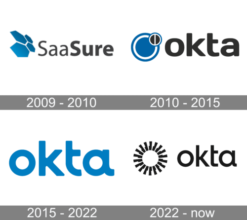
Okta is the name of an American software company, which was established in San Francisco in 2009 as Saasure. Getting its current name in 2010, the company started developing access management solutions, which today are used by thousands of businesses across the globe.
Meaning and history

Okta is a cloud platform that allows you and your colleagues to access all of the software in your company with just one login and password. That means that each assigned member of the team can access, for example, a corporate Zoom account, using the same password as his colleague. Okta lets you do this from your computer, tablet, or phone.
The actions of all employees are controlled by an administrator, who can assign a new member to a specific group within Okta to provide access only to the necessary set of programs and services. So designer apps are for designers, messengers — for managers, and so on. Actually, the variety of applications available for Okta use is truly impressive — over 6 thousand apps and the number keeps increasing. The Okta application catalog is divided into categories for easy application search.
What is Okta?
Okta is a cloud-based software for access management, which allows Al employees of one company to enter the corporate app accounts using just one login and password. The software was designed by the Okta company in 2010.
In terms of visual identity, Okta looks cool and progressive, although the logo of the software is pretty minimalistic, the smooth lines and heavy elements make it memorable and stable, reflecting confidence and reliability. The company was established under the name Saasure, but it only stayed for a few months, so the first logo was designed after the rename into Okta.
2009 – 2010
Initially, the platform, known today as Okta, was called SaaSure, and this is the lettering, that could be seen on its original badge, introduced in 2009. The logo featured a strict gradient blue and gray composition, with the emblem, composed of four hexagons, placed on the left from the bold and minimalistic sans-serif inscription in gray. The geometric elements of the emblem were placed the same way as a honeycomb.
2010 – 2015

The initial Okta badge was introduced in 2010 and featured a blue and black composition with delicate white details. The badge was composed of a geometric emblem, and a lowercase logotype, placed under it. The emblem boasted a large solid blue circle with a thick white internal outline. This figure stood for Single Sign-On technology, used in the software. The blue circle was overlapped but a small black one in its upper-right part. The black circle has the same white internal outline, but also a vertical white line crossing it, which made it look both lines a Power button, and like an inverted Prohibition sign, which symbolizes the protection of the access in the software.
As for the lettering, it was executed in the lowercase of a bold and modern sans-serif typeface with softened angles and a shortened horizontal bar of the “T”. It was set in black, balancing the small black roundel in the emblem.
2015 – 2022

With the redesign, the Okta badge became more laconic and cool. Although the typeface remained almost the same, the contours of the letters still were refined and the shape of “T” was changed significantly — with the tail getting arched and short.
The color palette was changed to a minimalistic blue and white, and the two-circles emblem — to a single ring one. The enlarged letter “O”, or the ring, or an outlined white circle, whatever it is, symbolizes the whole Okta.
2022 – Today
The redesign of 2022 has created a new visual identity concept for Okta. The badge is now set in black and white, with the abstract geometric emblem followed by the stylish lowercase inscription in a modern sans-serif font. The emblem of the platform features a circle, formed by eighteen equal elements, which create a sense of motion and look hypnotizing.


