Nurofen is a famous brand of pain-relief medication, which was introduced in 1983. The brand was acquired by Reckitt Benckiser in 2005. Nurofen is the fastest growing analgesic brand globally.
Meaning and history
Nurofen was introduced by Boots is 1983. During that period the British company , established in the middle of the 19th century, was one of the pioneers in the market of innovative medications. In 2005 the Nurofen brand was sold to Reckitt Benckiser, along with some other Boots developments.
Nurofen is an original drug manufactured by Reckitt Benckiser Healthcare International Ltd. The drug has a pronounced analgesic, anti-inflammatory, antipyretic effect. The drug contains the substance ibuprofen, which belongs to the group of NSAIDs (nonsteroidal anti-inflammatory drugs). According to research results, drugs in this group inhibit the synthesis of prostaglandins, which are mediators of inflammation and cause redness, pain, and swelling.
What is Nurofen?
Nurofen is the name of an antipyretic medication from the British company Reckitt Benckiser Group. Nurofen is used for such health conditions as headache, migraine, toothache, painful menstruation, neuralgia, back pain, muscle pain, rheumatic pain and joint pain; as well as for fever in the flu and colds.
1983 – 2005
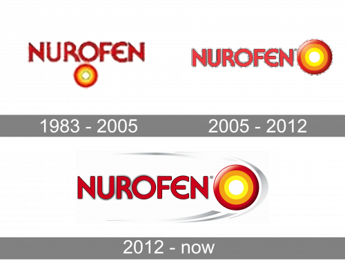
Nurofen’s first logo featured the brand’s name written in red capital letters, as well as their iconic round emblem right underneath. The written part had largely the same font as now – round and fluid. The emblem part consisted of three layers: white, yellow, orange and red – from inner to outer.
2005 – 2012
In 2005, they switched the letters to a paler shade of red, while also moving the emblem from beneath to the name’s right.
2012 – Today
The Nurofen logo is a reflection of brands description “Fast targeted relief from pain”. It graphically shows the audience the benefits of using Nurofen when in pain.
Bright red soft-lined wordmark on a light grey background is complemented by a graphical image of pain – a bright colored circle with a target pattern.
The red and orange color palette of the circle icon represents pain, which Nurofen fights with. The “target” comes through the grey pattern to show the soothing and fast relief from the pain.
The Nurofen logo is very modern and recognizable, it became iconic in Ontario market segment due to a bold typeface, colors and a perfect graphical representation of the products aim.
Font and Color
The bold uppercase lettering from the primary Nurofen logo is set in a custom sans-serif font with interesting contours of some characters. The closest typefaces to the one, used in this insignia, are, probably, Feltboard JNL, or Expressa EF Demi Bold, with significant modifications of some of the shapes.
As for the color palette of the Nurofen visual identity, it is based on the combination of red and gray, with yellow and orange accents on the emblem. The inscription in dark shade of red represents professionalism and confidence, while the brighter palette of the emblem shows the target of the medication, and its efficiency.


