Amgen, short for Applied Molecular Genetics, is a leading global biopharmaceutical company headquartered in Thousand Oaks, California. Founded in 1980, its mission revolves around discovering, developing, manufacturing, and delivering innovative human therapeutics. The company is publicly traded and its ownership is diversified among individual and institutional shareholders. Amgen boasts a global presence, extending its operations across the Americas, Europe, and Asia-Pacific regions. With an unwavering commitment to science and innovation, Amgen has played a pioneering role in developing breakthrough therapies for grievous illnesses.
Meaning and history
Founded in 1980 by George Rathmann, William Bowes, and several investors, Amgen, originally named Applied Molecular Genetics, emerged as a trailblazer in the biopharmaceutical realm. Over the years, the company has marked numerous milestones, such as the development and approval of key drugs like Neulasta, Enbrel, and Prolia. These groundbreaking treatments have addressed critical unmet medical needs, solidifying Amgen’s standing in the healthcare world. In recent years, the company has been at the forefront of biosimilar development, offering alternatives to some of the most widely prescribed biologic medications. Positioned at the nexus of biology and technology, Amgen continues to forge its path, dedicated to bringing innovative solutions to patients globally.
What is Amgen?
Amgen is a prominent biopharmaceutical company, renowned for its groundbreaking work in discovering, developing, and delivering innovative human therapeutics. Founded in 1980 and headquartered in California, it stands at the intersection of biotechnology and advanced patient care, consistently addressing severe medical challenges.
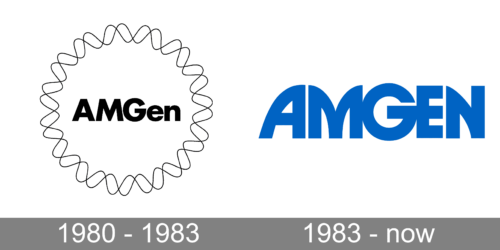
1980 – 1983
This design depicts a harmonious blend of modernity and fluidity. The word “AMGen” is boldly positioned at the center in a confident and straightforward typeface, which contrasts with the surrounding organic, wavy circle. This circle, reminiscent of an oscilloscope reading or perhaps the sinuous pattern of DNA, emphasizes motion, adaptability, and continuous evolution. The monochromatic color scheme enhances the logo’s minimalist appeal, focusing the viewer’s attention on the interplay between the firm typography and the fluid perimeter. This design suggests a company that is both grounded in its identity and yet always evolving, always in motion.
1983 – Today
This logo is the epitome of modern corporate elegance. The word “AMGEN” is rendered in bold, block letters, showcasing strength and stability. The use of blue, often associated with trustworthiness and reliability in the corporate world, reinforces this message. The lettering, with its subtle curvature and precise spacing, exudes professionalism and attention to detail. The “G” in “AMGEN” is particularly distinctive, with its stylized, interconnected design suggesting unity and collaboration. This logo speaks to a company that is confident in its capabilities, values unity, and seeks to convey an image of trust and reliability to its stakeholders.


