Essilor International S.A. is an ophthalmic optics company producing lenses to correct or protect eyesight. It is headquartered in Charenton-le-Pont, France.
Meaning and history
Essel was established in 1849 under the name of L’Association Fraternelle des Ouvriers Lunetteries. Originally, it was a modest network of eyeglass assembly workshops. Silor was established in 1931 as Lissac. Essilor appeared as the result of the merger of Essel and Silor in 1972.
1849 – 1931
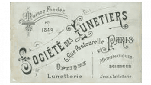
This logo belonged to the company’s predecessor, the ‘Societe des Lunetiers’, which means something like ‘Society of glasses makers’. This name was written in and old-timey Gothic font across a piece of paper, which was akin to a logo back then. Apart from the name, it also featured the year of founding, the address back then, and much more.
1931 – 1972
In 1931, they designed their first proper emblem – a monochrome depiction of a woman with the sight-assessing goggles attached to her head. Below, there was a lowercase writing in a pretty cursive font saying ‘les frère Lissac’ (‘the Lissac brothers’) – the owners of the company back then.
1972 – 2018
In 1972, they adopted this clever emblem: a blue square with an eye-shaped white part and a round lowercase ‘e’ in its middle, posing as pupil. The same style as this letter’s was largely used for the company name below – ‘Essilor’, written in all white lowercase letters.
2018 – 2022
In 2018, the company merged with Luxxotica, an Italian manufacturer of spectacles and lenses. As a result, the logo changed to this: names of two companies written in all capital letters back to back. ‘Essilor’ uses grey, and ‘Luxxotica’ is colored blue. The emblem depicted alongside this writing is a clever combination of two colors.
This symbol is a grey ‘E’ with intervals between some of its parts. The bottom-left portion, which looks like ‘L’, is instead colored ‘L. Both companies are, therefore, represented.
2022 – Today
The brand introduced a very stylish and modern logo in 2022. It removed all the other elements and kept only the name. It was printed using a different font, which looks very much like Avenir Next Pro Bold. The black color of the inscription and close spacing create an image of a strong and powerful company. Unlike the previous version, the logo has only the first letters of both parts of the name capitalized, which makes it unnecessary to use color for visual separation.
Brand’s logo
The centerpiece of the Essilor logo is a stylized human eye in white. Its center is formed by the lowercase blue “e.”
Below, there is the name of the brand in a sans serif typeface, where the lowercase “e” is combined with capital letters. Although the glyphs belong to lowercase and uppercase types, this is reflected only in their shape, while the height is the same. Due to this, the wordmark is perceived as a single whole.
The eye and the wordmark are both placed inside a blue box.
Corporate logo
This one is simpler, both in terms of the shape and the palette. You can see the name of the brand in a capitalized sans. There is a horizontal line below. It is bolder in the middle and thinner at the ends catching one’s eye and creating an illusion of gradually fading out.
Font
The type on the corporate Essilor logo supports the “fade out” theme presented by the horizontal line below. Many letters have sharp, gradually decreasing ends. On the whole, the type looks refined due to the combination of bolder and thinner strokes.
Color
The gray color of the corporate logo conjures up such values as “business-like” and “serious,” while the more vivid blue palette of the Essilor brand logo has more identity.


