NRL, or The National Rugby League, is the largest rugby league club championship in Australia and New Zealand. The league was founded in 1998 and today 16 teams are competing in it, and from the 2023 season, the list of participants will be increased by one.
Meaning and history
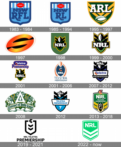
The NRL is definitely the strongest and the most famous rugby league in the world. Without any exaggeration, it even beats the British Super League. NRL features teams from Australia and New Zealand, and its first season was launched at the end of the 1990s, although it was in its current state, as the league in other forms existed since 1908.
The rugby league tournament has been taking place in Australia and only featured teams from Sydney. Some current National Rugby League clubs were formed as early as the first half of the 20th century, but there are examples to the contrary. For example, the Gold Coast Titans club only came into existence in 2007.
The average attendance at league games is 16,000 spectators per game. So it’s only logical, that the logo of the league has to be instantly recognizable and eye-catching, thus a lot of attention is being paid to its visual identity design.
Before describing the emblems of the National Rugby League, let’s have a look at several badges of the League’s predecessors.
1983 – 1984
The logo, designed in 1983 was created for NSWRFL, or New South Wales Rugby Football League. It was a bold and sleek badge featuring the traditional crest shape but in modern and confident execution. The color palette of the logo boasted two shades of blue, red, and white. The crest had its body colored in light blue with the upper part in white vertical stripes, and an extra-bold outline in a darker and calmer blue. The massive uppercase inscription, set in two levels, was executed in the same shade of blue, as the framing of the crest. The “NSW” lettering on top was written in a bit smaller size, than “RFL”, which was definitely emphasized on this badge. Above the inscription, there was a delicate solid image of a red rugby ball, placed horizontally on a striped background.
1985 – 1994
The redesign of 1985 was about shortening the name of the league from NSWRFL to NSWRL, so the word “Football” was removed from the long name, and the letter “F” — from the iconic blue-white, and red crest. It was the same composition with the same massive geometric serif letters, which boasted massive square serifs and the letter “R” having its tail elongated and slightly curved under the “L”. Interestingly, this badge, along with the previous version, became one of the most iconic logos in the history of the Australian sports.
1995 – 1997
In 1995 the league was renamed ARL, or Australian Rugby League, as several more teams joined the line-up. So the logo was redesigned in the same year and stayed with the new league for two seasons. This time it was a green and yellow crest in a triangular shape with arched sides. The upper border of the shield was completely flat, which added strictness and brutality to the logo. The body of the logo was colored yellow and had a dark green chevron pattern on it. As for the lettering, it was set in two lines — the dark green uppercase “Australia” was set in a bold and elegant serif typeface on a plain yellow background, on the very top of the crest, and the enlarged extra-bold “ARL” abbreviation in the center, executed in white and outlined in black. The rugby ball was drawn in white, with delicate green and yellow details, and placed under the main wordmark.
1997
The league was renamed again in 1997, and this time it was Super League. Though under the new flag it only stayed alive for one season, it still had its separate logo. The Super League badge featured a solid black background with a three-dimensional glossy “S” in orange gradients. The letter was executed in a stylized extended sans-serif typeface, which looked futuristic and very cool. Simple concept and minimalistic approach to the logo were kinda balancing the pretentious name of the league.
1998
The National Rugby League, or NRL, in its current state was established in 1998. And this is when the most iconic badge of the league was designed too. It was a crest with a straight and clean horizontal line on top and a rounded arched bottom. The body of the logo was colored in the calm and dark shade of green and had a yellow and black chevron pattern as the main motif. The “NRL” abbreviation in bold serif capitals was written in white with a thick black outline, and placed in the center of the chevron, under the vertically drawn rugby ball in white and black.
1999 – 2000
Another version of the badge has been in use along with the original one for two years. It was the same chevron with the lettering and a rugby ball, in the same color palette and style, but placed on a plain white background, without any crests and dark green shades. This version looked brighter and more eye-catching when placed on a contrasting background.
2001
In 2001 the NRL logo got some additions, to celebrate the new league’s sponsor, Telstra Corporation. So the iconic NRL chevron with lettering was now placed on a white background under the corporate Telstra logo, which was a horizontally stretched solid blue banner with rounded sides, in a thin double white and orange outline, and a bold white serif wordmark in the title case with the first letter overlapping a solid orange oval. Between the Telstra and NRL logos, there was a bold stylized “Premiership” inscription in a narrowed serif typeface with smooth contours of the blue letters, outlines in white and orange.
2001 – 2006
A few months later the logo was completely redesigned in the official Telstra colors. The vertically oriented solid blue badge was enclosed into two orange rounded brackets, which were placed on a small white space from the blue element. The orange and white rugby ball was playing a part of a crown on this version of the logo. As for the “NRL” abbreviation, it was executed in a bold serif typeface, in white color, and set on a blue background, under the Telstra signifier — a white and blue letter “T” overlapping an orange oval. The whole emblem was underlined by “Telstra Premiership” inscription in all capitals, executed in a lightweight sans-serif typeface, in blue.
2007 – 2012
For several seasons, starting 2007, the league has been using another version of the logo. It was based on the original NRL chevron but in a white, black, and blue color palette. The “Telstra Premiership” banner was set on the bottom part of the crest, and looked like a two-leveled rectangle, with its upper segment in white, with the blue and orange Telstra logotype, and the bottom part in solid black, with the white uppercase “Premiership” in a simple geometric sans-serif.
2008
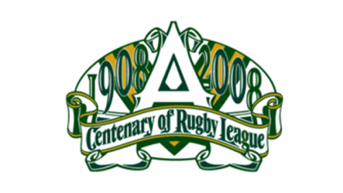
That one 2008 emblem was made for the 100 years anniversary of rugby in Australia. The foundation of the logo is a shape of a rugby ball where most elements are located. In includes part of the classic green-and-yellow shield emblem, the years ‘1908’ and ‘2008’, and the big capital ‘A’ written between them.
There’s also a ribbon-like element made of mostly green and white that says ‘Centenary of Rugby League’ in big elegant letters.
2012
The logo was slightly redesigned again in 2012, but the renewed version only stayed for one season. It was mainly about the Telstra part, so now both lines of the “Telstra Premiership” inscription were set on a white rectangle, written in one classic sans-serif typeface, in blue. As for the corporation’s signifier, it was set under the white banner and executed in white and blue. No orange elements were used for the new badge.
2013 – 2018
The redesign of 2013 has introduced a completely new NRL badge, which combines the original chevron motifs and new symbols. It was a glossy grass-green crest with modern white sans-serif inscription on its top part, the red “T” on an orange oval replacing the crown, and two yellow chevrons sat the bottom. In the center of the chevrons, there was a white and black man figure enclosed into yellow and white brackets.
2019 – 2022

The bright and colorful NRL badge was replaced by a minimalist black-and-white logo in 2019. The new concept features a bold black crest outline, two black chevrons, a black “T” with the oval on top of the frame, and the logotype under the crest. The logotype was set in two lines, with the “NRL Telstra” in all capitals of a modern sans-serif typeface written in smaller size and placed above the enlarged “Premiership” in the same font but with thicker contours.
2022 – Today
The 2022 logo depicts a plain shield shape of mostly lime. There are some white parts, such as two pointed line combinations, as well as the ‘NRL’ acronym in the top. This one uses normal sans-serif letters. However, some bits are fused together, while others are cropped out.
Font and color
The black and white color palette of the NRL visual identity is an interesting and not typical choice for the organization connected to sports. Although, the badge in monochrome looked extremely stylish and progressive, reflecting the League as a constantly growing and developing one.
As for the typeface on the badge, it is pretty simple and neat — a bold geometric sans-serif font with distinct contours and straight cuts of the bars looks pretty similar to such typefaces as Config Alt Bold, Moderna Sans Bold, and Kommon Grotesk ExtraBold.


