Big Bash League is the name of the famous Australian Cricket League, which was established in 2011 as the franchise of Twenty20. The League features a line-up of eight teams and a women’s subdivision, the WBBL (Women’s Big Bash League), which is getting more and more popular all over the globe.
Meaning and history
Cricket might be not one of the world’s most famous sports, but it definitely is one of the most loved in Australia. And as time goes its popularity only raises, which can be seen in the audience of Women’s Big Bash League, which had its first season played only in 2015.
Although the Big Bash League in its current state was established in 2011, its history traced back to 2005, when the Twenty20 KFC Cricket League was formed. So for the first six years of its existence, the league used a visual identity concept that was completely different from the one we all got used to seeing today.
2005 – 2007
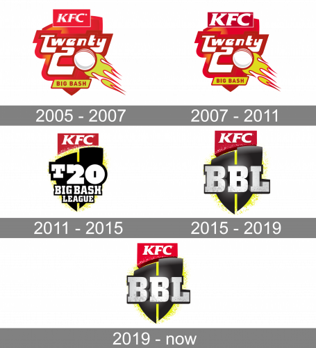
The very first Twenty20 KFC badge, designed in 2005, stayed with the league for two seasons and featured a bright red composition with a stylized crest, bold white lettering outlined in red, and a white ball decorated with the yellow and red flame on the right. The corporate “KFC” logo (white lettering on a solid red rectangle) was set on top of the crest, replacing a traditional crown. As for the “Big Bash” inscription, it was executed in bold red sans-serif capitals and placed on a thin horizontally extended yellow banner in a red outline, set on the bottom of the shield.
2007 – 2011
The redesign of 2007 hasn’t brought any major changes to the league’s badge, it was just the refinement and modernization of the contours and elements of the badge. The lines became bolder and stronger, and the “KFC” logo was changed according to the corporate redesign of the company. The white letters on a red banner got larger and bolder, and now were visible even more than the main “Twenty20” inscription on the main part of the shield.
2011 – 2015
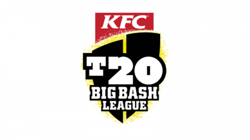
For the badge design of the new BBL concept, the competition was held. And the winning emblem stayed with the league for the first four years and became a basis for all future redesigns. It was a stylized modern crest in black, formed by two vertical segments placed on a small space between each other and with a slight vertical shift. The crest was placed on a white and yellow background, under the red and white “KFC” flag. The “T20 Big Bash League” inscription was set over the crest in bold serif typeface with all letters in white and outlined in black. The “T20” part of the wordmark was significantly larger than the two bottom lines.
2015 – 2019
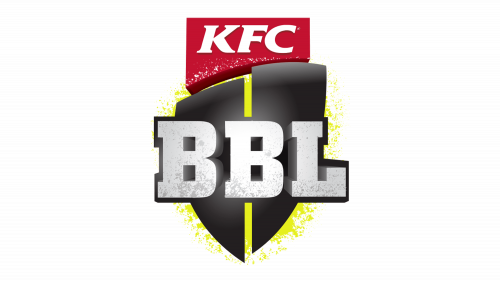
The redesign of 2015 made the League’s badge simpler, yet more modern and stylish. The main change was about the lettering — the long three-leveled white inscription from the 2011s badge was replaced by a cool gradient gray and white “BBL” abbreviation, which looked powerful and confident on the refined black crest, which also got some gradients to its body and a matte texture, that made it look three-dimensional. The “KFC” part of the logo also gained volume and shape and got its colors intensified. The calm yellow from the previous version turned into a fluorescent shade, which created a strong contrast and made the logo instantly recognizable.
2019 – Today
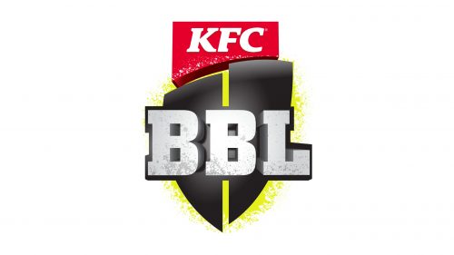
Slight refinements were made to the BBL logo in 2019. A bit more light shades were added to the logotype, especially to the negative space of its letters. The red “KFC” banner became a bit lighter and brighter too, creating a very friendly overall mood of the image. As for the crest itself and the yellow background — nothing changed here.
Font and color
The bright and brutal black, yellow and white color palette of the BBL emblem is a brilliant representation of strength and energy. While the red and white “KFC” banner on top of the composition added a sense of passion, care, and friendliness. This combination of colors makes the logo stand out and be visible on any background.
The massive shadowed “BBL” inscription in gradients is executed in an extra-bold serif typeface with strong thick contours and large serifs. The custom font looks pretty close to such typefaces as Square Slabserif 711 Pro Bold and Gravity Normal, but with some lines and contours modified.


