Norton is a British brand of motorcycles manufacturer, which was created in 1898. One of the oldest in Europe, the brand is highly recognizable and respected across the globe.
Meaning and history
Norton is not a brand, but a legend. The company, responsible for the production of one of the most iconic motorcycles in history, was established in 1898, and started with the production of space parts, introducing its first vehicle already by 1902. For the first six years, the Norton bikes had engines from other manufacturers, and the first in-house Norton engine was developed only in 1908.
Before the outbreak of World War II, the company had grown into a real market leader, constantly introducing all new designs and models. During the war years, however, production was halted. At the end of World War II, Norton returned to civilian motorcycle production, continuing to expand its range.
In the late 1960s, the entire British motorcycle industry fell into decline. It was caused by increasing competition with Japanese manufacturers. As a consequence, in 1969 the company went bankrupt and was transformed into Norton-Villiers.
After the decline of the British motorcycle industry, the Norton brand has undergone several revival attempts in various countries. The last attempt was made in 2008 when British entrepreneur Stuart Garner bought the rights to the Norton trademark, and in 2009 the company created a new modern motorcycle.
What is Norton?
Norton is the iconic manufacturer of motorcycles, which was established in Great Britain at the end of the 19th century, and by today has become synonymous with the motorbike culture, along with Harley Davidson.
1902 – 1913
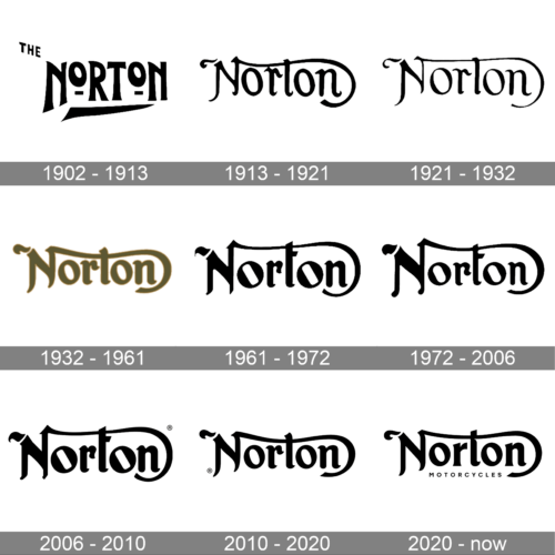
The logo has only “Norton” printed using a bold and unusual font. It is very similar to the Oligarchy Weathered typeface. The letters are of different sizes, which adds a unique character to the wordmark. The two “O”s are much smaller and have an underscore, which balances out its smaller size. The wordmark has a long line going underneath. It was just as sharp as the strokes forming the letters and resembled the blade of a knife. The logo also had the article “The” in the upper left corner, which was removed in the following versions. Combined with the font choice, the black color reflected the striking power, speed, and sophistication of the motorcycles.
1913 – 1921
This version looks a lot more elegant and its fluent lines reflect the classy and luxurious design of the actual motorcycles. The company used a classic cursive font with extravagant curves. The unique feature of this inscription was the letter “N”, which had a curve coming from the top of the right vertical stroke, crossing the “t” and curving underneath the last character. The black color was preserved, giving the logo that sophisticated appearance and drawing a line to the original version.
1921 – 1932
The updated logo looked very similar but it had a much more refined look thanks to more contrast in stroke thickness. The ends were also not as curvy, which turned out quite well and the logo was more fitting for the serious brand.
1932 – 1961
Although the color of the emblem was changed to pastel bronze, the brand did not lose its identity. This likely was chosen as it looked better on the motorcycles themselves and stood out more. Moreover, Bronze symbolizes strength, stability, and loyalty. The strokes were significantly thicker than in the earlier version, but the font otherwise looked similar.
1961 – 1972
The black has returned. Although the inscription looks very similar to the one seen earlier, each stroke has been modified in one way or another. The ends got even straighter, while the center of both “O”s resembles a rectangle with rounded corners placed on a diagonal. This surely added another unique touch.
1972 – 2006
As with previous updates, the logo underwent only minimal changes. The modification of such barely noticeable details in the logo reflected the fact that the brand never stopped improving and perfecting its products.
2006 – 2010
The logo introduced in 1961 was brought. It looks like no changes were made to it, but an attentive eye might spot a slight difference.
2010 – 2020
The company brought back another version of its logos. This time, it was the only logo that was done in a different color than black. Guess what? The Norton brand decided to color it black and the result has not disappointed.
2020 – now
A more modern logo was introduced in 2020. The cleaner lines made the logo look more stylish. There was one detail that would be hard to miss. It was a second line that said “Motorcycles” in small, uppercase letters using a basic sans-serif typeface that perfectly contrasts the classic strokes of the name.
Font and Color
The bold script lettering from the Norton banner has become iconic by today. The smooth thick lines with softened edges and angles look unique and sleek, evoking a sense of timelessness and sophistication, despite the heaviness and stability of each character. The closest font to the one, used for the Norton insignia, is, probably, Vintage Fonts Collection VFC Ruiz, but with the lines of come letters elongated and curved, creating an interesting ornament and framing the wordmark.
As for the color palette of the Norton visual identity, it is strict, laconic, and boring — all the lines of the logo are set in plain solid black, with no gradients or bright accents. This makes the logo look even more powerful and stylish, turning it into something ageless and always actual.


