Aixam is the brand of a micro-cars designing and manufacturing company, which was established in 1983 in France. Today the brand produces seven different microcar models, which are available with diesel, gasoline, or electric engines. The list of discontinued Aixam cars includes ten models.
Meaning and history
The Aixam visual identity is bold and bright. Based on the massive shapes and a strict royal blue and silver color palette, the emblem of the brand evokes a sense of authority and expertise and shows Aixam as a company, which values quality and comfort even in small sizes.
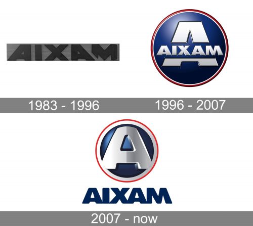
1983 – 1996
For the first decade of the company’s existence, its visual identity was based on the name of the brand, Aixam, written in all capitals of a bold and square sans-serif typeface with extra-thick lines and straight cuts of the edges. The letters were placed pretty close to each other, but still had some space between the lines, which made the massive structure look lighter and airier. The logotype was usually written in black or dark blue, which both looked confident and eye-catching on any color of the brand’s microcar.
1996 – 2007
The redesign of 1996 kept the massive lettering as the part of the new concept, but enclosed it in a circular frame, and made it a replacement for the enlarged “A”’s a horizontal bar. It was a matte-blue circular medallion in a double red and white outline, where the gradient white “A” with the “Aixam” in all caps crossing it, placed on a blue background, were set in the middle. This was a pretty complicated logo, which stayed with the brand for eleven years and got replaced by a simpler and more modern version in 2007.
2007 – Today
The redesign of 2007 separated the logotype from the medallion, and now the sleek and smooth “A” on a circular blue medallion was placed above the bold blue lettering. The outline of the medallion was refined and emboldened, and now the white part, which became more silver on this version, was thicker than the outer red one.
As for the “A”, it was completely redrawn, and gained more volume, having its softened bold contour three-dimensional. The right part of the letter featured a darker shade, closer to silver-gray, while the left part remained glossy white.
The Aixam logotype was set in the uppercase and colored deep blue, with no gradients. The style of the lettering repeated the one from the “A” on the emblem, softening the contours of the extra-thick letters in a custom typeface.
Font and color
The Aixam logotype is executed in a bold rounded sans-serif, designed exclusively for the brand. Its massive letters with softened angles slightly touch each other, and the “M” is a bit slanted, having its right bar inclined to the left. The font, which is more or less close to the one on the Aixam visual identity is Rifton Caps, but the lines of some letters need to be modified.
The Royal-blue, white, and red color palette is one of the most elegant and traditional combinations in contemporary design. It reflects stability, professionalism, and high value of style and beauty, showing at the same time the brand as a trustworthy and reliable one, and with a touch of passion and love, given to the logo by its thin yet bright red outline.


