Aston Martin is a famous British company that designs and manufactures high-end cars. It was established in 1913 and became popular in the 1950s. Today the brand operates in more than 50 countries across the globe and is one of the most recognizable luxury car producers.
Meaning and history
The first name of Aston Martin company was Bamford & Martin, after the names of its founders, Robert Bamford and Lionel Martin. The brand got its current name in 1914 after Martin raced up Aston Hill in Buckinghamshire. The name of Robert Bamford was removed, without any objections from his side.
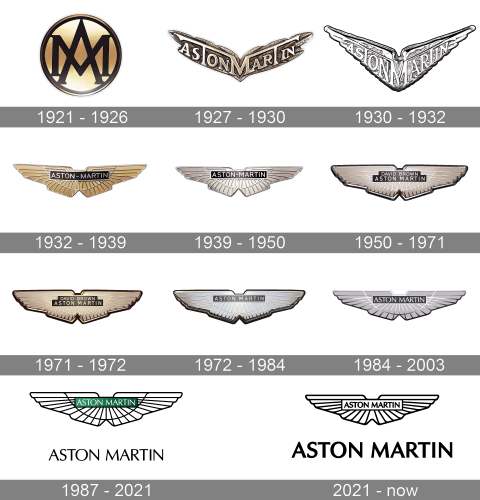
The Aston Martin logo was first created in 1921, and for the first seven years, the company used only its wordmark.
The brand’s visual identity has dramatically changed just once, in the very beginning, and after the iconic Aston Martin emblem was designer, the company’s logo was only slightly modified until today.
What is Aston Martin?
Aston Martin is a luxury British manufacturer of sports cars, which was established in 1913. The company’s name comes from Aston-Clinton Hill, where one of the founders, Lionel Martin, won the Singer-10 race.
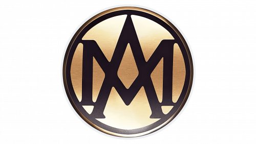
1921 – 1926
The first logo of Aston Martin was designed in 1921 and featured a circle with the company’s initials. The black letters “A” and “M” in a classic typeface were placed on a golden background. It was a stylish and elegant example of a logo for its times.
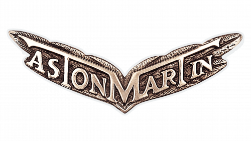
1927 – 1930
The iconic emblem was born in 1927. It is still far from the logo we can see today, but the idea was created.
The bronze wings with a wordmark placed right on them and the letter “M” in the middle, spreading its lines to the horizontal bars of the letters “T”, symmetrically locates on both wings.
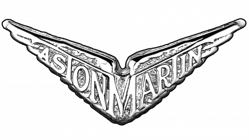
1930 – 1932
The original logo was slightly modified. The color palette was changed to silver and the shape is more triangular and sharp now. This was with the brand for only two years.
1932 – 1939
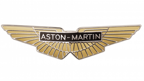
In 1932 the Aston Martin logo starts getting a more simple and modern shape. The wings are flattened out and the wordmark is now placed in a small rectangular in the middle of the emblem.
The color palette is changed to gold and black, which makes the logo look sleek and luxurious. The typeface of the wordmark is simple and clean.
1939 – 1950
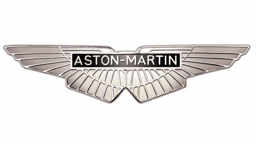
The color palette was switched to silver and black, the shape of the emblem became more angular and distinct. In 1939 the base of the current Aston Martin was designed. It is strict and high-end.
1950 – 1971
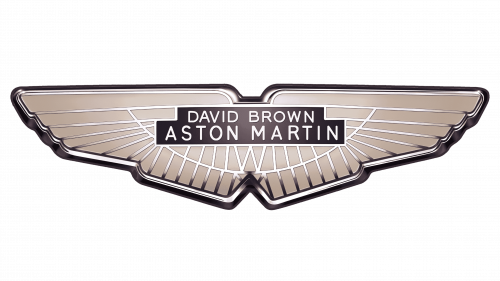
In 1947 the company was taken over by David Brown, and the logo was changed by adding his name to the wordmark in 1950. The name was put above Aston Martin’s nameplate in smaller lettering.
The color of the emblem’s background is beige with thin silver lines, resembling of freedom and lightness.
1971 – 1972
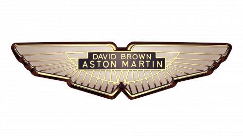
The “David Brown” logo is still in use, but the color palette is slightly changed. Silver is replaced with gold and the Aston Martin logo evokes a more luxurious feel than ever before.
1972 – 1984
In 1972 the Aston Martin brand was bought by Company Developments Ltd, and David Brown’s name was removed from the logo. Another change made to the brand’s visual identity during these years was a new color palette.
The background got a new cold gray tone, while the gold lines remained but became lighter.
1984 – 2003
The redesign of 1984 was not the best one and its result stayed for quite a long time. The logo became more brutal and lost its sophistication because of thickening the outlines and enlarging the wordmark. The letters are narrowed and look less balanced than on the previous versions of the Aston Martin logo.
1987 – 2021
The logo was created in 2003. It features a refined contour of the wings with a dark green rectangular for the wordmark. The fine elongated lines of the lettering look sleek and expensive, while the strict colors add authority and sense of expertise and prestige.
2021 – now
The redesign of 2021 has simplified the color palette of the Aston Martin visual identity to black and white, removing the iconic moss-green from the composition. The new badge fully repeats the contours of the previous version, but all the lines here are emboldened. The most visible change was made to the logotype, written under the graphical emblem. It got its letters enlarged, and the lines of the characters thickened up.
The Emblem
The iconic winged emblem was created in 1927 and is one of the most recognizable car symbols in the world. During the years the emblem has been simplified and modernized and today it is composed of two wings, reflecting the speed and freedom.
The Aston Martin emblem is an example of contemporary design and eternal movement. Its silver color represents the brand as stable and descent, with its strong values and loyalty to its customers and heritage.
The Aston Martin emblem is elegant and minimalist, it symbolizes luxury, air, and eclecticism. It is timeless and sophisticated due to the perfect choice of simple typeface and color palette.
Font and Color
The elegant uppercase lettering from the modest monochrome badge of Aston Martin is set in a medium-weight sans-serif typeface with smooth lines and full-chapped characters. The closest fonts to the one, used for the Aston Martin insignia are, probably, Carisma Classic DemiBold and Faber Sans Pro 75 Halbfett.
As for the color palette of the Aston Martin visual identity, it is based on a timeless elegant black-and-white combination, which looks simple yet powerful and confident, showing the brand at its best.
The 2017 concept
In 2017 Aston Martin presented a completely different logo, which is only used on branded fashion items. The logo features a double-framed circle with a diagonal line pattern. It is executed in the monochrome palette and has nothing in common with the iconic Aston Martin wings.
What does the Aston Martin emblem look like?
The iconic Aston Martin emblem features a stylized wings-like badge, which was first introduced in 1927, and has been redesigned several times throughout the years. The current emblem of the brand looks more elegant and chic, it’s the wings drawn in a minimalistic style, in black medium-thick lines over a white background.
Is Aston Martin owned by Ford?
No, Aston Martin is owned by a group of investors and has had nothing to do with Ford since 2007. But yes, the luxury British automaker was owned by the iconic American company for longer than a decade, with the acquisition taking place in 1994.
Is Aston Martin still British-owned?
Yes and No. Since 2007, the legendary British automaking brand has been owned by a group of investors, and many of them are British. However, the biggest stack, 25%, is owned by Lawrence Stroll, a billionaire from Canada.


