The Northwest League, known for its vibrant role in minor league baseball, operates as a key part of the Minor League Baseball (MiLB) structure. Owned by Major League Baseball (MLB) as of its acquisition in 2020, the league has a rich history of fostering emerging baseball talent. Primarily, the Northwest League showcases its teams across the Northwestern United States, offering a platform for young athletes to hone their skills and progress in the sport. This geographical focus includes states like Oregon, Washington, and Idaho, making it a prominent regional hub for baseball enthusiasts and aspiring professionals alike.
Meaning and history
The Northwest League, established in 1955, was the brainchild of several baseball enthusiasts aiming to revive minor league baseball in the Pacific Northwest. Over the years, it has carved out a reputation for being a launching pad for future Major League stars. Notable achievements include nurturing numerous players who later excelled in the Major Leagues, contributing significantly to the development of baseball in the region. Its evolution saw changes in team compositions and league structures, reflecting the dynamic nature of minor league baseball. Currently, as a part of the MLB’s restructuring of minor league systems, the Northwest League stands as a High-A level league, continuing to be a crucial step in the journey of players aspiring to reach the pinnacle of baseball in the Major Leagues.
What is Northwest League?
The Northwest League is a minor league baseball organization, operating as a High-A level league under the oversight of Major League Baseball. It serves as a critical developmental stage for emerging baseball talent, offering a competitive platform for athletes in the Northwestern United States.
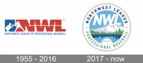
1955 – 2016

The original logo depicts the acronym ‘NWL’, written in big, red letters. That being said, their left-most side is extended further into a rectangle of sorts. On this extended shape, they’ve put white silhouettes of a catcher and a hitter, ready to strike the ball. The ball itself is a little dot half-way into the acronym with a line that goes from it, across the letters and off into the right.
2017 – Today

The soft and transparent colors of the Northwest League logo make it highly recognizable and eye-pleasing. The emblem, which was introduced in 2017, depicts a tranquil landscape – a mountain, a forest, and a lake below the blue sky. There’s a baseball on the forefront, which creates a link to the sports theme.
The landscape is encircled by the lettering “Northwest League” in dark blue and “Professional Baseball” in green.
In comparison with the emblem used by the Northwest League in 1955-2016, the current one looks calmer and more peaceful. Also, it is more distinctive than its blue-and-red predecessor.


