

Zoom seems to have become a universal means for video calls, like Photoshop for image editing or Google for web searching. During the coronavirus pandemic, we often heard something like “I have an appointment on Zoom” or “I’m connecting to Zoom in 5 minutes”. And this phenomenon brought the video calling service onto the crest of the wave. Now it’s time to pay back the success.

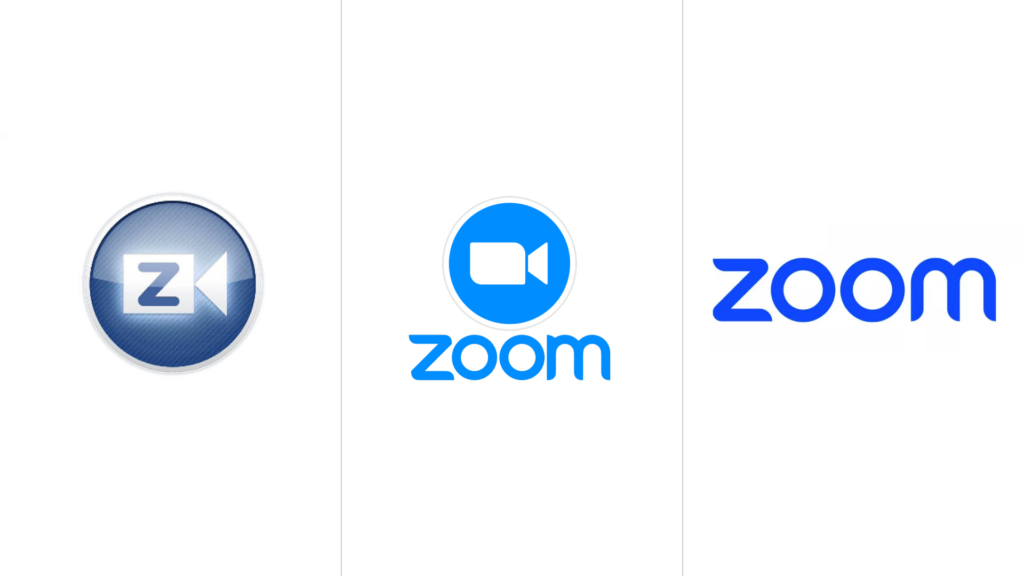
As Zoom decided an update its visual identity, it faced a couple of issues. First, Zoom is not positioned as a brand but as a service in the video calling segment. In addition, end-users really think so. However, the platform argues that video conferencing is only a part of a wide range of its services. Accordingly, the company is seeking to position the platform as a versatile tool for facilitating cooperation and team working. Zoom has therefore presented an original version of its logo with six “O”’s.
Actually, the main version of the emblem still has two “O”’s, renovated with an “m” without the left upper end. Also, the logo’s color was changed to a more intensive blue. And finally, the camera sign has been removed.
The “Zoooooom” wordmark, as an expansion of “Zoom”, is featured in an animated version of the logo, and each “O” has an icon inside which symbolizes a proper service of the company. This representation is connected with a new promotion campaign that will be led on TV, and social media as well as outdoor advertising carriers.
Admittedly, Zoom is more than just video calls like those of WhatsApp or Telegram. In terms of corporate use, the company has, however, serious competitors such as Microsoft Teams integrated into Microsoft 356, and Google Meet in Google Workspace. So, besides the rebranding, Zoom needs a powerful incentive to achieve success in this complicated sector.


