

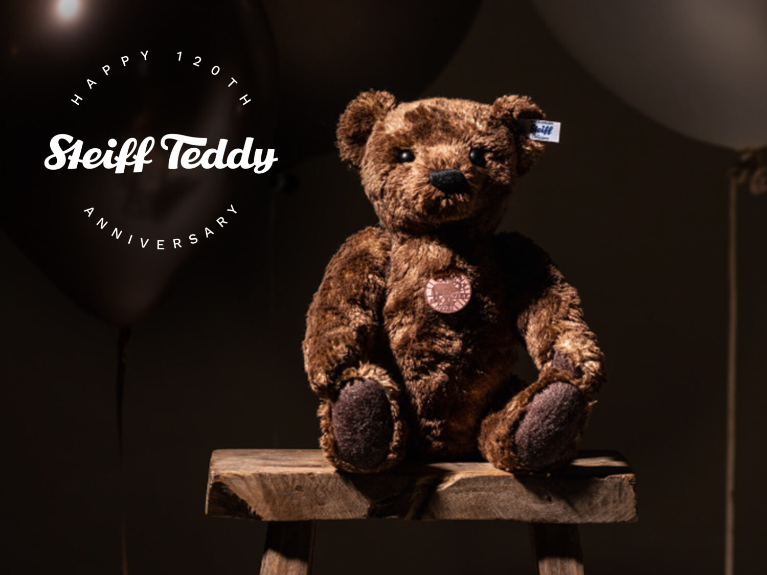
The toy brand Steiff, known for its plush toys, has rolled out a new visual identity. The updated look is focused on the famous Teddy bear which is celebrating its 120th anniversary this year.
![]()
Steiff was founded in 1880 as a reformed company that evolved from a felt goods business owned by Margarete Steiff in Giengen, Germany. In 1902, a plush bear, which was designed by Margarete’s nephew Richard Steiff and wore the ordinary production name Bär 55 PB, was “born”, having movable arms and legs. One year later, the bear got popular in the United States after an American trade buyer ordered 3000 pieces of toy bears in the wave of the talk about an incident with President Theodore Roosevelt, who refused to shoot a bear while hunting. And eventually, the toy bear was named Teddy, after Roosevelt’s nickname.
So it’s Teddy, and no other toy, who is designated to symbolize the Steiff brand now. And celebrating his 120th birthday, the company has placed the head of the iconic teddy bear as a central part of its new logo which was developed by the design agency Peter Schmidt Group.
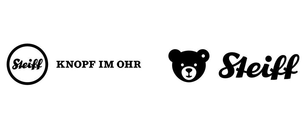
As the company press release says, the plush bear, that made Steiff world-renown, will be the main element of the brand’s emblem. More exactly, it’s the teddy’s head with a “button in the ear” as a sign of quality. It demonstrates a strong link between the brand and its unbeaten bestseller. As a renowned and beloved image in black and white, the bear head, reduced to its basic traits, is placed above the well-known wordmark, awakening sentiments and childhood memories. The white spot in the teddy’s ear symbolizes the Button in the Ear (Knopf im Ohr), a special authenticity mark for the Steiff products.
The rebranding has completely changed the architecture of the Steiff logo. The tagline “Knopf im Ohr” was visualized in the teddy’s ear button. The general design, as the brand’s representatives say, complies with the requirements of digital technology. The Steiff wordmark was optimized, retaining its recognizability, while the letters were aligned more straightly. The large spaces between the elements have to make the whole logotype clearer, while drawn in small sizes as well as in digital apps.
For Steiff’s overhauled branding, the new logo is accompanied by a pastel color palette and typography including the classic Bondi and Work Sans font. “The new look is an expression of the empathy to the values of the brand and stands for Steiff’s heritage, children’s dreams, and the excellent premium quality”, Peter Schmidt managing director Rudiger Getz said.


