

In our reviews, we have repeatedly talked about new logos and brand identities that were developed by Wolff Olins. The latest works by the studio include the redesigns of such brands as LG Electronics, Western Union, and Instacart. Now, the famous design team presents a refreshment of its own visual identity, including a logo, a website design, and other brand assets.
![]()
Founded in 1965, Wolff Olins is headquartered in London and operates subsidiaries in New York, San Francisco, and Los Angeles, a city where the company opened its office only this year. So, the redesign indeed celebrates a significant event in the life of the studio.
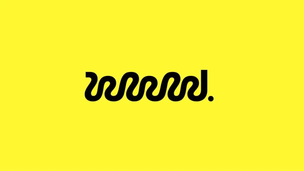
Updating its look, the studio tried to depart from the strictness the brand had before. The previous Wolff Olins logo represented a two-line black wordmark in an all-caps typeface based on the Europa Grotesk font family.

For the new identity, the studio slightly changed typography, executing the wordmark in lowercase font. However, the most remarkable element of Wolff Olins’ overhauled logo is the initial “W”. Becoming a new symbol of the studio, the letter has received a personalized and unconventional form, as if it were drawn by hand. Designed as a wavy line, it strongly contrasts with the rest of the lettering. In general, the emblem is rather minimalistic, while the wormy detail and a yellow background, in a lighter shade compared to the old version, make the design quite attractive.
Another Wolff Olins novelty is the redesigned website. The new interface was developed to properly represent the works of the studio, arranged by the activity fields of its brand customers. Led by the agency’s global and creative directors, the redesign process also involved specialists from the Brooklyn, NY-based studio Oak.
The Wolff Olins homepage currently displays some of the works the studio created in 2023. You can find details on the visual transformations of popular brands like LG, GSK, Tik Tok, or Uber. The archive section includes more examples of Wolff Olins’ creativity. The studio’s digital asset uses sans-serif typography for most texts, while serif fonts are reserved for headlines and detached texts to be in contrast with the general typography.

As Wolff Olins global director Thomas Wilder said, the studio’s ultimate goal is to help brands get renewed. The design brand’s evolution also widens the range of offerings and launches new services. “We feel that it’s time to transform ourselves now, and we hope that they’ll enjoy it like we’ve enjoyed our journey”, Wilder added.


