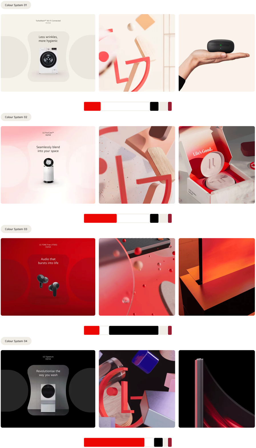
This April, LG Electronics lifted the veil on its new visual identity, publishing a teaser video with a winking LG face. Now, launching a global campaign, the South Korean manufacturer presents its next-stage branding, created by Wolff Olins, to the fullest extent. Besides the animated face logo, it includes a new color palette, a serif typeface, and other design elements that enrich the brand’s interaction with customers.

The overall task of Wolff Olins was to fully reimagine the entire range of the brand’s visual assets, including physical carriers, digital apps, and promo activities that could be harmoniously suited to each other and, most importantly, the recognizable LG character. As Tom Carey, the studio’s creative director, says, the company’s look is more people-oriented, as it doesn’t just tell you about a brand from which you can get this or that appliance but adds some warmth and vividness that will guide customers through LG’s experiences.

This concept gave new perspectives on the principles and philosophy of the company, allowing the designers to formulate three key ideas for the new brand identity: people-centered innovative technology, unyielding customer experience, and a good feeling that can make people smile. According to Carey, the most challenging thing was to create a visual identity that would be “full of personality”, helping LG keep in touch with its audiences in different markets.
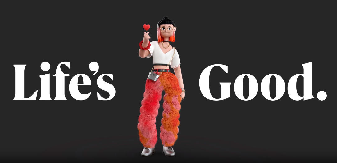
Among the new elements of the LG brand, we can notice Joy and Ryder, cheerful characters that were created by South Korean illustrator Ryu Jung-min. Designed in a playful and optimistic style inherent to Ryu’s works, they are intended to demonstrate “the most fun and expressive side” of the brand. Moreover, some features within the images of the two characters, like Ryder’s ring with the Goldstar symbol, pay tribute to the company’s history.

Studio Animade from London was in charge of the animated visuals, where the characters dance or make other movements. Thanks to the Animade team, Joy, for example, can fly around Times Square on a hoverboard. Joy and Ryder play the role of social stickers, as well as the finger heart, which is a reference to K-Pop culture. Also, the LG brand is expected to be added with more characters.
The brand’s central feature, however, is still LG’s iconic smiling logo, which is now animated with more expressiveness. Its fresh appearance, taking on eight different behaviors, is depicted against a background of a new red hue, while the brand’s traditional tagline “Life’s good” is designed in a new custom typeface developed by Type Foundry F37.

Overall, Wolff Olins has done a great job, infusing LG with a breath of fresh air. The brand can really play with new facets now that it has a more playful and effusive identity. And this will effectively work on different levels, spicing up the dull world of home appliances.


