

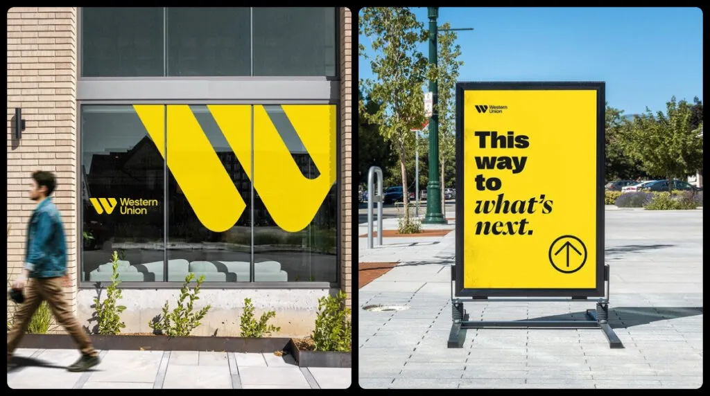
Western Union, the world’s leading money-transfer company, has carried out a large-scale rebranding. The project has been implemented in cooperation with the design studio Love Street & Co. The new Western Union logo still retains its brand colors but demonstrates a new design approach with a bolder look at its global identity.
![]()
According to a press release, the rebranding’s all-encompassing strategy marks an important milestone in the 172-year history of the company. The brand is looking to a more integrated and progressive future, keeping in mind globality as the company’s services are available in every corner of the world.
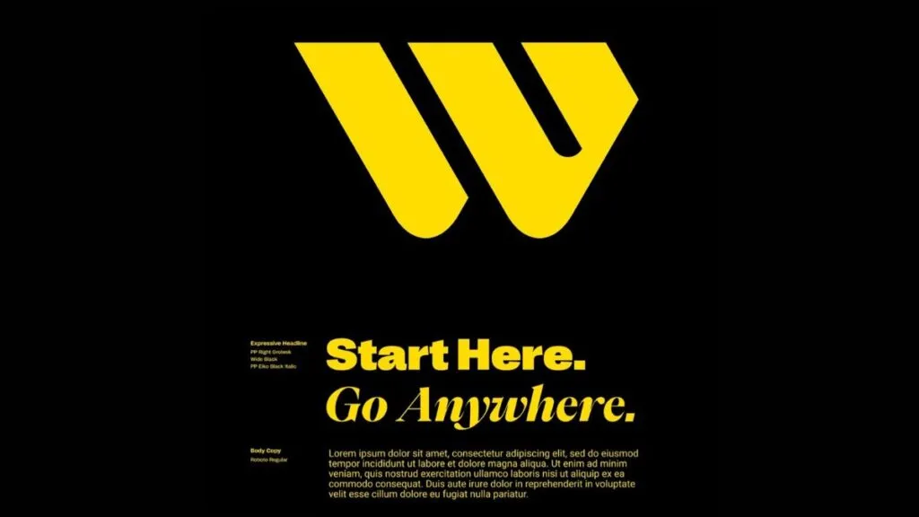
Western Union’s new identity showcases a more modern design of the logo where the initial “W” turns into a symbol with bolder and simplified typography. Although the company abandoned the WU abbreviation, it saved the Western Union wordmark, keeping the integrity of its branding, while the refreshed design signals a new era of growth and innovations.
As Love Streets & Co. explains, Western Union is not a “crypto-unicorn-millenal-fintech-startup”, but the world’s best solution for international money transferring and the most available financial service company.
WP’s new logo doesn’t just feature contemporary aesthetics but is also intended to symbolize the company’s aspiration for staying relevant amid the constantly changing landscape of finance.
Accordingly to its general rebranding view, Western Union chose a typography style that provides a harmonious balance between modernity and timelessness. The typeface is solidly bold, conveying confidence and clarity. The typography complementing the logo also creates an amazing identity across different touchpoints. Additionally, an interesting aspect is a slope on the upper right of the “W”.

In printed and digital materials, the company will use the PP Right Grotesk font for headlines and Roboto for body texts.
The design system developed by the studio embodies the basic values and aspirations of Western Union. This system provides a base for coherent visual elements and brand books as well as a unified interaction with the brand itself across all platforms and channels. Expressing the essence of WU, it serves as a road map for the future growth and expansion of the marque.


