

Unión Deportiva Las Palmas is coming back to La Liga, after having played in Segunda for five years. On this occasion, the Gran Canary football club has presented its refreshed visual identity inspired by the team’s essence and the individuality of the Canaries.

The new look of UD Las Palmas, created by the local design agency More Amore Brands, is built around the wave symbol which derives from the original typography from the club’s crest and is also used as an architectural element in many buildings on the island.
The wave also gave inspiration for a custom typeface for the club, named UDLASPALMAS. Designed by Aillatyped Studio, the font is distinguished by wavy strokes and special ligatures which give it a strong individuality. It plays a crucial role in the new identity, being a uniting element for the whole branding.
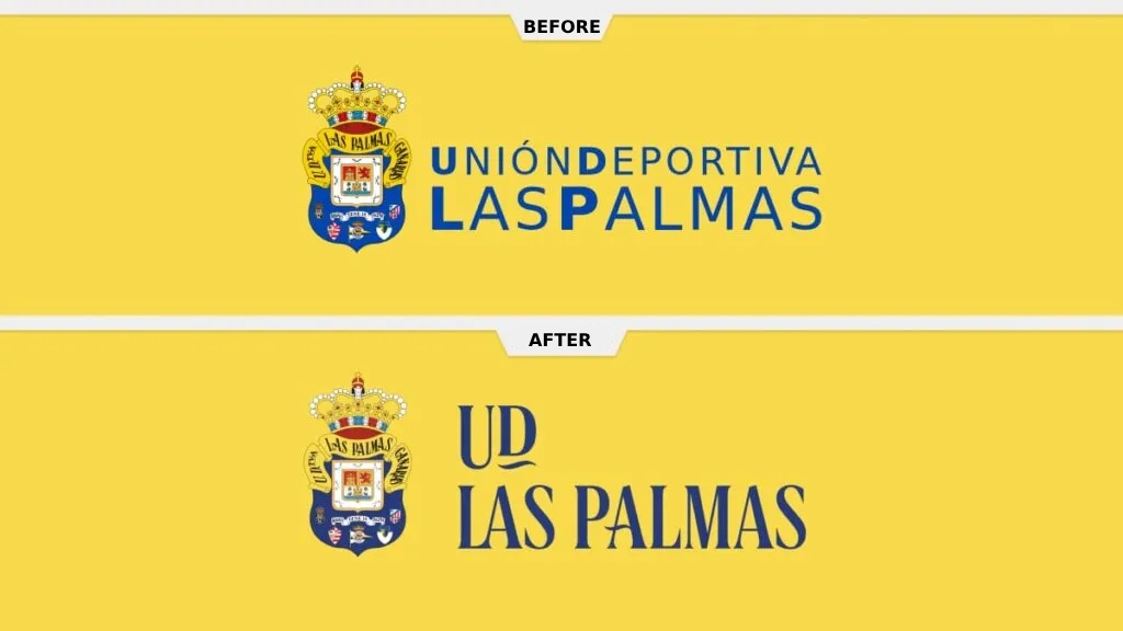
By shortening the club’s name to UD Las Palmas for the wordmark, the design studio managed to create a special icon based on the UD acronym, adding a tilde under the “D”.
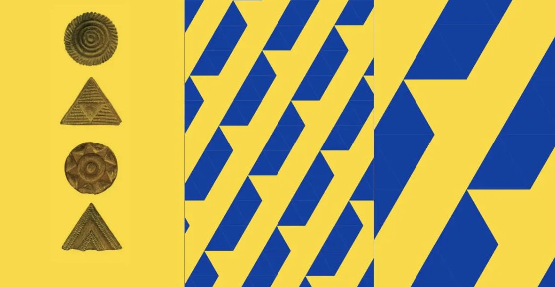
Besides, the visual identity includes a system of graphic elements and textures inspired by Gran Canary itself. This asset is planned to be used for communications means. One of the design motifs symbolizes the dunes of the Maspalomas beach, while another one is a reflection of the Canarian pintanderas, special stamps which were used by the pre-Hispanic natives of the Canary Islands.

During the rebranding process, the design team tried to seek a kind of synergy among all the departments of the club. To this end, the brand architecture was unified with a more integral system where the UD icon appears as a uniting umbrella. This unifying strategy comes to life to provide the interconnection of the sub-brands and affiliates of UD Las Palmas, while the UD sign helps the club achieve a consistent approach in all its directions.
Rebranding in the football world is a special topic. Some teams bet on an identity upgrade including a redesign of the crest. Juventus, Aston Villa, or Valladolid are bright examples of that. Clubs switch from their traditional shields to new logos to improve the marketing of their brands, which often causes disapproval from fans.
However, that’s not the case of UD Las Palmas as the management chose to keep the shield untouched. The team says they respect their crest and those who made it possible for the club to be launched, stating that “the best heritage is not to change the shield”.

The football team’s crest focuses on the current emblem of the City Council of Las Palmas de Gran Canaria, accompanied by the shields of the five founding clubs that merged together to form UD Las Palmas in 1949. The upper part of the shield features a yellow band with the name of the club. The crown on the top is an interesting detail, too. Although the team’s name doesn’t include “Real”, which means “Royal” in Spanish, this element was inherited from Real Victoria, one of the founding clubs.


